Capturing the magic of Harry Potter with just a font can be tricky, but it’s not impossible. This article will explore some of the best fonts available on Microsoft Word that might be able to help you convey a bit of that wizarding power.
Best Harry Potter Fonts in Microsoft Word
The best Harry Potter fonts are Chiller, Bradley Hand ITC, and Snap ITC. Each font offers something unique and different, but they all come with a great theme that works well in the wizarding world. It’s worth trying them out to see which you prefer.
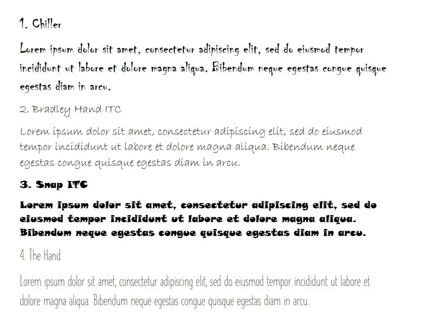
Chiller
Chiller is a great choice that suits a lot of fantastical themes. It can work really well as a Harry Potter font because it comes with a similar “drooping” effect at the bottom of every letter (which you might see in the Harry Potter logo).
If you were to attribute an adjective to Chiller, it would be something like “magical” or “fantastic.” Since both of those words work really well for a Harry Potter theme, it makes sense that Chiller should rank quite highly on this list.
It’s also quite a popular choice. The size of the font makes it ideal for both titles and the main bulk of the text. Generally, it’s better as a title because of the unique style that comes with it, but it’s up to you to decide where you prefer it.
Bradley Hand ITC
Bradley Hand ITC is an interesting choice that captures different energy from the world of Harry Potter. This time, we’re looking at it as a font that some of the students in Hogwarts might use. It looks like it’s been written with ink and quill.
Bradley Hand ITC comes with thin, sharp lines to create its lettering. That’s where the idea of the ink and quill comes from. It looks like a sharp quill is scribbling on a piece of parchment, which is on point for the wizarding world of Harry Potter.
As far as handwriting fonts go, Bradley Hand ITC is one of the more popular ones. It’s easily recognizable and has a surprisingly iconic style that makes it well worth using if you’re looking for something interesting.
Snap ITC
Snap ITC is a good font that comes with a similar style as the Harry Potter logo. It has small droops at the bottom of some of the letters, which is also seen with the lightning bolts in the Harry Potter logo.
It’s a somewhat magical font, making it a solid choice for most. Though, we would recommend using it as a title font rather than something that fills the main body of the text. It’s a bit too thick to work well if you include it in the majority of your writing.
For the most part, people want a Harry Potter font when they’re trying to create a presentation or document that’s more in line with the theme of Harry Potter. Ideally, that means you’ll use a more standard font for the text body (like Arial), but go big with the font in the title (like Snap ITC).
The Hand
The Hand is a somewhat decent choice that can work. It’s another “Hand” font, which means it’s related to handwriting. As far as fonts for Harry Potter go, this might not always be the best choice. However, it’s a suitable font for the main bulk of the text.
Let’s imagine you’ve already picked one of the fonts in this list for the title in your Word document. That’s great news, but you don’t think you’ll be able to use the same font for the rest of the document.
That’s where The Hand comes in. It’s easy enough to read, but it’s stylish enough to keep up with the Harry Potter theme that your chosen title font is trying to convey.
Juice ITC
Juice ITC is a great font that captures similar vibes to Harry Potter fonts. It looks like a very magical font, and people like it for the unique energy it brings to the table.
Juice ITC is mainly used as a title font. It looks much better as a title because of its thick lettering and unique capitalization style. While it can work in the main body of the text, we don’t recommend it as such because it can be tricky to read.
It’s a great font to include at the top of your poster, document, or presentation. Anywhere else might make it a bit tricky.
Mistral
Mistral is a great take on the handwriting that might come up in the Harry Potter world. Wizards use ink and quills, and we’ve already touched on some good choices that replicate this. Mistral is yet another choice that looks like ink and quill could have written it.
The style of Mistral makes it look rushed but attractive. That’s what makes it so ideal if you’re looking for something to work alongside a Harry Potter font.
Freestyle Script
Freestyle Script is another ink and quill font that’s worth going through. It’s a bit less messy than Mistral, but it still comes with that similar rushed feel that you might expect from a Hogwarts student trying to complete some magical homework.
It’s a great font that gets a lot of usage in Word. It’s very popular for what it can do, and the style makes it suitable as both a title and within the main body of the text.
It is a little smaller than some of the other fonts in this list, so you need to account for that. But, if you like the look of it overall, there’s no reason why its size should have much of an impact on determining whether it is used.
Informal Roman
Informal Roman is another good choice that could replicate the style of writing of the Hogwarts students. It looks like a hastily scribbled form of handwriting, with sharp lines that are iconic when you think about ink and quills.
It’s a good choice if you’re looking for something more exciting in the main body of the text. People will like looking at this one on the page because it really stands out and helps them to read the main text quite comfortably.
In terms of popularity, Informal Roman isn’t as popular as you might first think. While it is a very attractive font, it seems like there aren’t too many Word users out there that know about it.
Brush Script MT
Staying with the ink and quill trend allows Brush Script MT to work well as a Harry Potter font. Again, it looks like a quill is scribbling something on a page, which is great when you’re looking for something that would fit in with Harry Potter.
Brush Script MT comes with fairly bold letters, which could make it difficult to read if you’re using it in the bulk of your text. We recommend it more for titles to help your readers understand the things you’re trying to write.
It’s a fairly large font. People like using it because it’s visually striking, and it matches the ideas of what people are looking for with a Harry Potter theme.
Curlz MT
Curlz MT could be a suitable choice for people that like a little bit of style with their lettering. Curlz MT has “curls” in most of the letters, which allows it to stand out from the crowd. Its unique style is what makes it so popular.
The curls are also pretty good when you think about it as part of the Harry Potter world. While there are no direct uses of curls in the Harry Potter font, Curlz MT captures a very similar energy that makes it look like it belongs without having to try very hard.
Rage Italic
Rage Italic is a great choice in many cases. It’s another font that comes really close to matching the same hurried look of a quill and ink. It’s a great one to replicate the writing in Harry Potter’s universe.
People like to use Rage Italic because of the interesting style that it presents. Naturally, it’s all in italics (hence the name), which a lot of people are attracted to.
It adds a lot of personality to the page, and the name “Rage” is fairly fitting, considering the slightly rushed look you get from it. It almost looks as if a student was trying to hurry through their writing in Hogwarts.
Viner Hand ITC
Viner Hand ITC is another good handwriting font and the last one we want to go through. It looks really good because the thickness of the lines makes it look like it’s written by a quill again.
Viner Hand ITC is a very visually appealing font. People like to look at it, and it can work as both a title font or as the main text. It’s up to you to determine where you’d like to see it more.
The thickness of the lines is what really makes this one stand out. It’s worth looking into to see whether you can get it to work well in your presentation.
You may also like:
12 Fonts That Look Like Children’s Handwriting in Word
5 Best LaTeX Fonts in Microsoft Word
12 Best Military Fonts in Microsoft Word