Typewriters might not be a common thing anymore, but that doesn’t mean that people don’t want to recreate the look of one. There are some really good fonts available on Microsoft Word that should help you to get close to how typewriters look. This article will explore them.
Best Typewriter Fonts in Microsoft Word
The best typewriter fonts in Microsoft Word are Consolas, Courier, Lucida Console, and Agency FB. They all work really well to bring about the same characteristics of how typewriters used to look. There are plenty of others, but these are some of the best on offer.
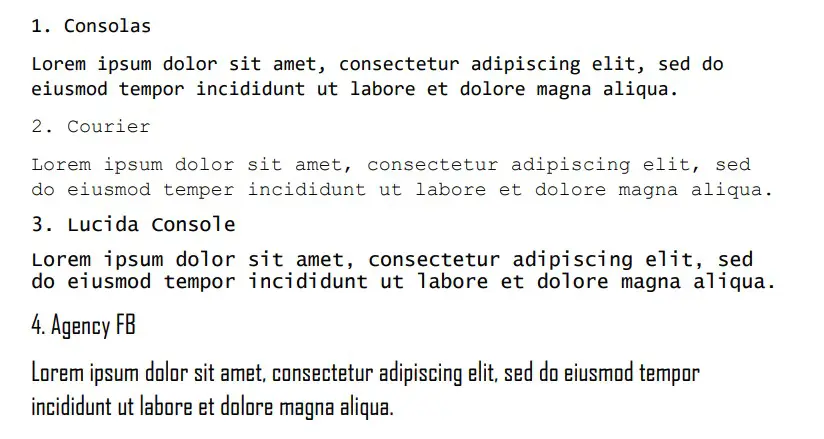
1. Consolas
Consolas is a great font that imitates what typewriters can produce. It comes from the idea of a “console,” which is the font name used for most typewriter-based fonts. It shows that someone is writing in a uniform way, and the letters follow that trend.
Typewriters tend to have quite distinctive fonts about them. They have a fairly thick ink with a boldness that’s undeniable. Each letter looks almost identical to the last, and they follow the lines in a uniform way that looks almost as good as computer processors do today.
Of course, there was always room for a bit of error in a typewriter. That’s why Consolas works fairly well. It doesn’t lean into the perfection that you might find with standard Word fonts like Times New Roman. Instead, it keeps some of the boldness about it that a typewriter might show.
It is a very easy font to read, though. That makes it a strong contender when it comes to looking at which of these is the most popular typewriter font.
2. Courier
Courier is a great font choice for typewriters. In fact, you could argue that it’s one of the best ones because most people say that typewriters wrote in Courier. It’s believed to be the font that was created to succeed typewriters once they went out of fashion.
If you were to type on a typewriter right now and compare it, you’d probably find that Courier is the closest relative. It looks almost identical to how most typewriters looked, making it a solid choice for many.
On top of all of that, it’s also a very popular choice. Many people like to write in Courier because it’s simplistic and easy to read. Typewriters wouldn’t have used a font similar to it for all those years if it wasn’t really easy for people to read, after all.
3. Lucida Console
Lucida Console is a good one that uses the “Console” name to show that it is trying to replicate a typewriter. It’s a great one because it shows uniformity with the letters being used. Each letter follows the same trends and rules, making it very easy to read.
You might also notice that some of the tall letters like “l” and “i” have little backward lips on them. This is a fairly standard style choice when creating a console-based font or one that is trying to imitate typewriters.
A lot of people like to use Lucida Console. It’s part of the larger Lucida family, which happens to be quite a popular font in most situations. There seems to be a Lucida font for just about everything.
4. Courier New
Courier New is an extension of Courier. The “New” comes from the idea that it’s an upgraded version of Courier. It might not be as true as Courier to how typewriters looked, but it’s a more modern take on how it might look if they were still around today.
To be fair, there aren’t many noticeable differences between Courier and Courier New. Courier New is just slightly more pronounced (i.e. looks slightly bigger, making it easier to read).
People tend to use Courier New more today because it’s a bit more convenient. While the changes are minuscule, they were enough to allow people to use Courier New over the more old-fashioned Courier style.
5. Agency FB
Agency FB is a really fun font that can work to create specific styles from a typewriter. It may not be historically accurate, but it introduces a new personality and take on the original typewriter style.
You might be surprised to learn that Agency FB is a very popular font. People like to use it when they are writing in many styles, though it’s most commonly chosen as a more informal option.
It is a sans serif font (which differs from the serif fonts we’ve seen so far). It’s a great choice if you’re looking for a more friendly feel with your typewriters, though.
6. Times New Roman
Times New Roman is the standardized font of Microsoft Word. If you’ve used Word before, you’ll already know about Times New Roman. We wouldn’t be able to list typewriter fonts without including it somewhere.
Times New Roman works really well as a typewriter font. It should come as no surprise that it’s one of the most popular fonts in the world. It’s so popular because of how easy it is to read, which is ideal when you’re looking for a typewriter font.
It is fairly small compared to some of the other options, but that doesn’t matter all that much because of how comprehensible it is. You’ll have a hard time finding anybody who can’t understand what Times New Roman is trying to say.
7. Lucida Fax
Lucida Fax is the second font name under the Lucida family of fonts in this article. Fax can work well, and it’s a very similar font to Console. It includes all the normal trends of Console, but it introduces a more formal, serif style to the font.
If you’re looking to be more formal than what Lucida Console had to offer, Lucida Fax is for you. It uses “Fax” in its name because it relates to the font that most fax machines would have used.
8. Niagara Solid
Niagara Solid can work well, but you need to be careful with it. It’s a good font, but the letters are very close together, and it can be difficult for some people to read. It’s still good for most situations, though, and it works well as a typewriter font.
Because of the “Solid” nature of this font, it is very bold and thick. That also makes it a bit more challenging for some people to comprehend. If there are multiple letters within the same line, people might have a rough time with it.
It’s not the most common font on this list, but it’s still a good choice if you’re looking to create that typewriter familiarity.
9. Ubuntu Light
Ubuntu Light is a fairly good choice if you’re trying to recreate how typewriters look. While typewriters didn’t look exactly like Ubuntu does, there is a very close resemblance that needs to be talked about.
Most typewriters used serif fonts to write letters and pages. Serif fonts come with extra lips on the ends of letters to help make them more pronounced and readable. Times New Roman (and many others on this list) are great examples of that.
Ubuntu Light is a sans serif font. The serifs are removed when Ubuntu is used, which introduces an interesting style.
Ubuntu Light looks like a typewriter font without the serifs. If a typewriter were to ever write in a way that excluded serifs, it’s more than likely that Ubuntu Light was going to be the font choice for that typewriter.
Also, Ubuntu Light is a popular font today. That’s why it’s worth mentioning as a typewriter font.
10. Trebuchet MS
Trebuchet MS is another great sans serif font that typewriters could have used. Again, most typewriters wrote in serif, so it wasn’t likely to come across Trebuchet MS. Nevertheless, it’s still a good replication that removes the serifs entirely.
Some people just don’t like writing with serif fonts. That’s why it’s a good idea to look into some sans serif fonts that can be used to create the same feel or style as a typewriter.
11. Segoe UI
Segoe UI is part of the Segoe family of fonts. It’s a very popular family in the world of Microsoft Word. There are plenty of good options, but Segoe UI is the best one if you’re looking to match it up with how typewriters used to look.
UI means “user interface.” It relates more to the kinds of fonts you’d use on a webpage to help the visitors navigate. But it wouldn’t have gotten this name if it wasn’t comfortable to read and easy to figure out.
That’s why it can work well as a typewriter font, and it’s worth giving it a go before you disregard it.
12. Palatino Linotype
Palatino Linotype is the last font we want to go through. It comes back to the serif fonts that most typewriters use, and it also fits the bold criteria that you would often find with old-fashioned typewriters.
It’s a fairly common font, though some people would argue that it’s not the best for typewriters. We included it as a last resort just in case you decided that none of the others worked for you.
You may also like:
12 Best Christmas Fonts in Microsoft Word
12 Best Calligraphy Fonts in Microsoft Word
What Is the Disney Font Called in Microsoft Word?