There are fonts for just about everything. If you’re looking to theme or present your writing in certain ways, you’ll want to find the best fonts. This article will look into the best handwriting fonts that will allow you to come close to how you might write on paper.
Best Handwriting Fonts in Microsoft Word
The best handwriting fonts in Microsoft Word include Segoe Script, Pristina, and French Script MT. There are so many options, each one offering something different from the last. Some look more cursive, while others look more informal or like someone was rushing their writing.
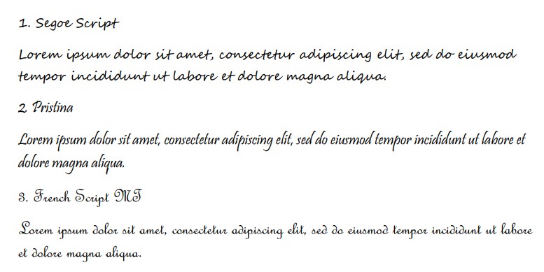
1. Segoe Script
Segoe Script is a very popular choice when it comes to handwriting fonts. It looks sleek and elegant. It’s great both formally and informally, depending on the context that you need it for. Most people enjoy it because it doesn’t come with any unnecessary flicks.
Segoe Script is a cursive font. Some cursive fonts fall victim to being overly curly or flicky. They will have lines jutting out at awkward angles, making it much harder for people to read when it’s seen on a page.
Luckily, Segoe Script doesn’t suffer from this. Instead, it’s one of the easiest cursive fonts to read. It also appears quite large compared to the font size, making it a very comfortable pick for most.
2. Pristina
Pristina is a great choice for handwriting fonts. It doesn’t follow the same cursive trends as some of the others. Instead, it looks more like someone is scribbling or writing with a bold pen, and all of the letters offer certain characteristics to demonstrate this.
Pristina is a very attractive font. Many people opt for it when they’re trying to recreate handwriting because of how it looks on the page.
The varying boldness is the main selling point. It’s made to look as though you’re using a pen and applying different pressure to the letter with every stroke.
3. French Script MT
French Script MT is a good example of cursive writing. It comes with all the expected lines and connectors that allow each letter to flow on to the next. Some users believe it to be a bit over the top, but it suits the cursive traditions better than most.
There are plenty of interesting curls in French Script MT. It’s not a direct match to most people’s handwriting, but it’s certainly a good choice if you like to write in cursive.
If anything, you’ll find this font is best used for more formal presentations. It can be quite tricky to read, and it runs smaller than the selected font size. You’ll have to take that into account before using it.
4. Lucida Handwriting
Lucida Handwriting has the perfect name for a handwriting font. If the name itself includes “Handwriting,” it shouldn’t be surprising that it’s one of the best options on this list. It’s another semi-cursive font that avoids all the overly formal curls and flicks.
Lucida Handwriting is up there as one of the most popular fonts on this list. It is used by many people that want to create a document that looks as if someone has written it by hand.
The only thing that Lucida Handwriting is missing compared to something like Pristina is the varying stroke boldness. Lucida Handwriting comes as one solid line with no variation. It still looks really good on a page, but it misses the main characteristics of genuine pen and paper writing.
5. Mistral
Mistral is a great choice if you’re looking for a more rushed or scribbled writing style. It isn’t all that easy to read because of the style that comes with it, but people like to use it when they’re trying to convey a rushed feel for their handwriting.
It’s quite a formal font, as the lines and strokes are meant to resemble somebody rushing to write a letter with a quill and ink.
It follows old-fashioned writing trends too. For example, the letter “l” is made to look like a loop. There is a distinct gap in the middle that shows it’s all part of one looped stroke, which is a more old-fashioned handwriting trend.
6. Bradley Hand ITC
Bradley Hand ITC is another good handwriting font. Though it doesn’t strictly state “handwriting” in the name, “Hand” is always a good word to look for in a font to show that it’s trying to imitate what handwriting might look like.
Bradley Hand works well as a handwritten font because it has varying brush boldness and sizes. You’re able to almost follow the pen strokes along by looking at where the lines get thinner and thicker (just like a real pen would look while writing).
Also, each letter seems to be slightly offset from the last, making it look more like a human wrote it rather than a robot or computer. It’s a great way to add personality to your writing with a simple font change.
7. The Hand
The Hand is another great handwriting font that also includes “Hand” in its name to show that it works well. The Hand is a little different than Bradley Hand ITC, though. It is much narrower, and you’ll find that it’s a little less popular.
While it might not be as popular, it’s still a great handwriting choice. It works really well because it offers people a unique way to write. The letters are narrow, but they’re designed in a way that really allows you to see the character and personality coming out in them.
8. Kristen ITC
Kristen ITC is a great one, though we recommend you only use this one for informal presentations or writing. It’s very bold and big. Many people avoid using it formally because it doesn’t look like it belongs. Nevertheless, it gives off a great personality.
The idea behind Kristen ITC comes from this rushed look that most people have when writing. Most people don’t have perfect handwriting. In fact, if you were to study one hundred people’s writing, you’d probably pick out at least half (or more) that you’d consider “messy.”
Kristen ITC replicates this messiness. It shows that nobody is perfect, and everyone has letters that don’t seem to fit into the same lines as their other ones. It’s a great way to be a bit more realistic with your handwriting.
9. Monotype Corsiva
Monotype Corsiva is a fancy name for a fancy font. It looks really good in most situations, and it’s an excellent simulation of how handwriting might look in a word processor. It’s got all the little licks and flairs that you might see when someone brushes their pen off the page.
As far as handwriting fonts go, Monotype Corsiva is slightly more formal. It is a serif font, meaning that there are serifs attached to the edges of most letters.
10. Ink Free
Ink Free is a unique handwriting font. It might look a bit messy and rushed, but that’s because it’s supposed to. The style of Ink Free plays into the idea that someone is writing naturally rather than trying to meet any particular cursive guidelines.
Most people don’t write in cursive styles, which is why Ink Free is such a suitable font. It is much more informal than most of the others, but it’s a great one to use to show that you just want to write like a normal person rather than try and impress anyone with your cursive talents.
For that reason, it’s quite a popular font. You’ll find a lot of people using it to showcase their more informal handwriting skills.
11. Segoe Print
Segoe Print is a branch of the Segoe font family. The difference between Print and Script comes from the letter connectors. Print doesn’t have the same connectors between the letters, and a lot of people prefer it because of that.
If you look at most people’s handwriting, you’ll notice that their letters aren’t connected. It’s much more common for people to write each letter individually rather than worrying about grouping them all up.
That’s what Segoe Print introduces. It allows you to be more true-to-form with your own writing. Since most people print their own letters (“print,” meaning not to connect them), you can use Segoe Print to be more in line with that.
12. Tempus Sans ITC
Tempus Sans ITC is the last one we want to go through. It’s not a particularly popular choice, but it still looks good on paper if you’re trying to recreate the look and feel of certain types of handwriting.
The line style of Tempus Sans ITC is what sets it out from some of the rest. It is a bit more erratic and uneven than most fonts, which plays more into the idea that someone is using a pen to create it.
Other standard fonts (like Arial, Calibri, and Times New Roman) have uniform line styles and sizes. Every letter looks the same, which makes them easier to read.
While Tempus Sans is a bit harder to read when it’s a smaller font, it’s still a good choice because of how clear the gaps between the letters are.
You may also like:
12 Best Typewriter Fonts in Microsoft Word
12 Best Christmas Fonts in Microsoft Word
12 Best Calligraphy Fonts in Microsoft Word