Chalkboard fonts have very specific looks, and it would help to come up with some good ones to use. Unfortunately, there aren’t too many that you can use in Word. Luckily, you can download a few free ones to get a more authentic feel. This article will help you out.
Best Chalkboard Fonts for Microsoft Word
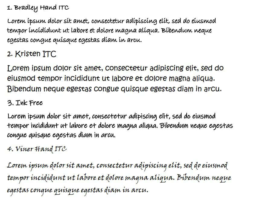
The best chalkboard fonts already on Microsoft Word are Bradley Hand ITC, Kristen ITC, and Ink Free. They all capture the same energy that you’d expect from a childish chalkboard font. They can work well to allow you to explore a more creative look with your writing.
Bradley Hand ITC
Bradley Hand ITC is a great font choice for many situations. It can work as a chalkboard font because it looks like someone took some chalk and started to write in fairly messy handwriting. This theme works well since most people don’t focus on their handwriting on a chalkboard.
Bradley Hand ITC is also a very popular font choice that’s worth spending some time getting used to. It can look good as part of a title or in the main body of the text. You might find that it works well to help break up more formal writing that uses serif fonts too.
For example, if a character in a novel has just found a note scribbled on a chalkboard, it might be worth you breaking up the flow of the novel by including Bradley Hand ITC to show what was written on the chalkboard.
Kristen ITC
Kristen ITC is another good font for chalkboards. It comes with an even messier energy than Bradley Hand ITC, making it a solid choice for many cases. It’s also bolder in style, which looks more like someone is applying pressure with chalk.
Kristen ITC is quite a popular font choice. It’s popular because it runs quite large compared to the chosen font size you’re writing at. This usually makes it easier to read, though it is definitely better suited more to titles than to the main text body.
Ink Free
Ink Free works very well as a chalkboard font. It looks like someone has scribbled out their writing with chalk. The implication of “ink free” implies that someone is writing without a pen or pencil, meaning that it’s more likely to use a traditional chalk pen.
Ink Free is a very stylish font that works well in many situations. You will find it has its uses in both the main title or the main body of the text, depending on where you think it works best for your writing.
Viner Hand ITC
Viner Hand ITC is a great choice for a handwritten font on a chalkboard. It includes similar features to what makes Bradley Hand ITC such a good choice. Viner Hand is slightly more formal as it comes with a more cursive or serif style.
If you’re going to pass this one as a chalkboard font, it’s best to use it in a more formal setting. For example, if you’re in a Victorian school, the chalkboard might be written with something similar to Viner Hand as it is more formal and respectable.
Viner Hand ITC is a fairly popular font choice, which makes it quite suitable for many situations like this. There are plenty of ways for you to use Viner Hand ITC in your writing, and it would help to find out for yourself how it works best.
Freestyle Script
Freestyle Script is another good choice that can work well and plays into the scribbled theme of a chalkboard font. It looks good in many situations, and the specific style of Freestyle Script allows it to work for both titles and the main body of the text.
A lot of people like Freestyle Script as a more informal “Script” font. A lot of the fonts listed as “scripts” in Word are more formal, and they usually have a more cursive feel about them that doesn’t always work well (especially not in the sense of a chalkboard).
While Freestyle Script is technically a cursive script, it works well to replicate the kind of writing you might see on a chalkboard. It doesn’t include any of the excess “noise” or lines and flicks that most other cursive fonts would.
Tempus Sans ITC
Tempus Sans ITC is the last official font you can use to recreate the chalkboard style. It isn’t as good as some of the others, but it comes with that same messy, scribbled look that a lot of these fonts really benefit from.
Tempus Sans ITC is a bit thinner than the rest of them, so it doesn’t look as good as a title. You’ll find that it works best in the main text body.
Not all chalkboard fonts are already installed in Word. However, there are plenty of free fonts available for download. All you need to do is search for “chalk font” online or go to a trustworthy font site like dafont to find some of the best free fonts for any situation. We’ll cover chalkboard fonts for download next.
Chalk
Chalk is a great font that can be found on dafont. It works really well for what you’re looking for because it looks as though the font has been scribbled on a board in white chalk. Since that’s the idea of a solid chalk font, it works well in most documents.
Of course, it’s not a particularly useful font for the main body of the text. You’ll be much better off using it as part of a title because of the size and style that comes with it. It’s very visually attractive, making it a good choice in many situations.
It’s also the most popular chalkboard font on dafont, which says a lot about whether it’s worth downloading. It’s definitely a font that you’ll be able to get a lot of use out of.
Chalk-y
The next best chalkboard font is Chalk-y. It works well because it looks like it’s been etched onto a chalkboard with a much thinner chalk stick, which is a good look if you’re looking for something that might work well in the main body of the text.
To clarify, we don’t encourage you to use Chalk-y for your entire presentation or document. It can work well for a selection of words, but it is still a difficult one to read if you use it too much in your writing.
Chalkboy
Chalkboy is a great font available on dafont that can work really well to capture that scribbled childish energy that you’re looking for with a chalkboard font. It has rough lines scribbled through each letter, which really helps the boldness stand out above the rest.
You can use Chalkboy in many ways, but we reserve it mainly for titles. It’s a very striking font, and a lot of people like to use it when they’re trying to capture the attention of their readers without needing them to understand what is being written about yet.
PW Chalk
PW Chalk is another good chalkboard font you can find online. It looks like a very thin chalk pen has been used to scribble the letters repeatedly. Each letter looks like it has been scribbled on top of itself a handful of times before someone was happy with it.
It’s quite a popular choice when it comes to chalkboard fonts. While it ranks slightly lower than some of the other options, PW Chalk is still a great one that you’ll be happy to download and keep installed on Microsoft Word.
Remember, once you’ve downloaded a font once, it’s yours to keep. You might find multiple areas where a font like PW Chalk can work, and that’s ideal when it comes to what fonts are going to work best for you.
Chalk Dash
Chalk Dash is a very childish font that looks really good as a title. It looks the messiest of all the fonts we’ve listed so far, with very rough outlines and scribbles in the font. It’s a great choice that works really well in many situations.
It can be quite tricky to read, which is why we think it works best as a title. It doesn’t look great when you write it in font sizes smaller than 18pt, so you’ll need to account for that before you do anything specific with it.
Chalk Dash is a great choice, though, and we’re sure you’ll find plenty of good uses with it.
Right Chalk
Right Chalk is the last chalkboard font we want to share. You can download it online, and it looks really good for what you’re trying to achieve. Like many of the downloadable chalkboard fonts, Right Chalk does a much better job as a title rather than the main body.
You’ll find many uses for Right Chalk, and it’s worth looking into it to find out which works best for you. It looks more like the chalk has been smudged or sprayed across the board, which gives it a slightly more unique style than some of the other font options.
You may also like:
12 Best Serif Fonts in Microsoft Word
12 Smallest Fonts In Microsoft Word
12 Best Cursive Fonts in Microsoft Word