LaTeX is a document preparation system that many people like to use in place of Microsoft Word. It can work wonders for academic papers, allowing you to cite things much easier or include indentations where necessary. This article will explore some of the fonts used in LaTeX.
Best LaTeX Fonts in Microsoft Word
The best LaTeX fonts in Microsoft Word are the standard serif fonts like Times New Roman, Bell MT, and Goudy Old Style. Basically, any standard computer font that you like the style of will closely match the font of LaTeX. LaTeX’s font is known as “computer standard.”
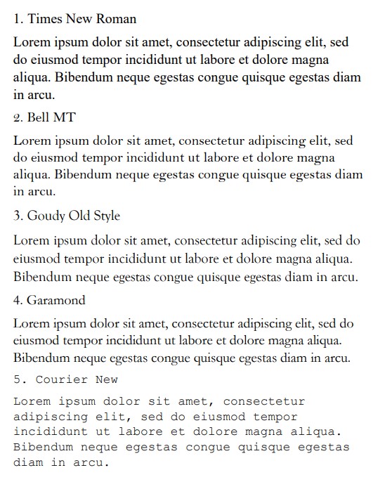
Times New Roman
Times New Roman is the perfect font if you’re looking for a standard one to use in your system. Before Calibri overtook it, Times New Roman was the most popular font on Word, and it was the default one that was registered to most systems.
Now, Times New Roman is slightly less common because people prefer the more informal sans serif fonts (like Calibri and Arial). Still, Times New Roman is a great serif font, and it’s been known to be one of the easiest fonts to read that’s available on Word.
It looks almost identical to the font used in LaTeX. To reiterate, LaTeX uses a font known as “computer standard.” Pretty much any default serif font will be very similar to this, so it can be quite easy to find a suitable match on Word.
We like to think that Times New Roman is your best bet because of how popular it is. Since it’s so recognizable because of its popularity, you really can’t go wrong if you try to use it.
This article is mainly aimed at those that don’t have access to LaTeX. If you want to try and recreate the same font styles by using the more standard Word, Times New Roman is font choice number one.
Bell MT
Bell MT is a fairly close second if you’re looking for a good LaTeX font. It’s another standard serif font registered with Microsoft Word. While it might not be as common or popular as Times New Roman, it still has its place in the hall of fame for Word fonts.
It’s another attractive font with serif style formatting. The serif-style fonts are often the easiest to read. Serif just looks more appealing when read either on a screen or on a physical page.
Since LaTeX only writes with a serif style, fonts like Bell MT and Times New Roman are going to be your closest matches. It’s worth getting used to them to figure out which one you prefer.
The main difference between Bell MT and Times New Roman is the size. Bell MT’s lettering is slightly smaller than Times New Roman.
Goudy Old Style
Goudy Old Style is a decent choice, and we thought we’d include it because it introduces a unique style. While it’s still a solid, standard font for Microsoft Word, it’s not as readable as Times New Roman or Bell MT.
What Goudy Old Style lacks in readability, it more than makes up for with charm. The whole point of finding a font similar to LaTeX fonts is that you’re not using LaTeX. If you’re trying to replicate the feel without copying it completely, Goudy Old Style is going to be a great choice.
It’s a fairly common font choice. Goudy as a font family is a popular choice, and Old Style offers a serif style that feels a bit more traditional. It’s not identical to the computer standard font used by LaTeX, but it’s not far off.
Size-wise, Goudy Old Style runs at a similar size to Bell MT. It’s quite small relative to the usual computer standard and LaTeX font, but it still does a great job of including a lot of information in a very small space on a page.
Garamond
Garamond is another standard Microsoft Word font that works well to replace the computer standard of LaTeX. You should give this one a try if you’re looking for something that might not be as popular as some of the others but still offers a good stylistic choice.
Garamond looks like a slightly thicker Goudy Old Style. The two fonts are very similar. They are both serif fonts, but Garamond tends to let their letters open up a little more to be a bit easier to read.
Since it’s easier to read than Goudy Old Style, some people would argue that it’s a more fitting font to replace the LaTeX fonts. This is true in many situations, but we believe it comes down to personal preference before anything else.
If you like the look of Garamond over Goudy Old Style, then you should use it. Likewise, if you prefer them the other way around, then Goudy Old Style is the better fit for you.
It may be a subtle difference, but it’s enough to completely change your font choice, depending on which you prefer.
Courier New
The last suitable font is Courier New. This is a very popular font that people use when trying to replicate coding. Since LaTeX offers users a way to include coding in their documentation, it makes sense that Courier New should make an appearance.
Courier New doesn’t have to apply to coding alone. It can work well to write the bulk of your document in Word. It’s a very standard font that follows all the same serif styles as the fonts we’ve included before it.
Of all the fonts we’ve listed here, Courier New is the most unique. It’s the one that stands out most on the page because of the spaces that are present between the letters that the other fonts don’t have.
Due to the spaces, it can mean that Courier New doesn’t allow for as many letters or words per line. With that said, it’s a very popular font, and a lot of people are able to recognize Courier New quite easily from just a handful of words written in the font style.
You may also like:
12 Best Military Fonts in Microsoft Word
12 Best Fonts for a CV in Microsoft Word
12 Best Fonts for Academic Papers in Microsoft Word