Good academic papers deserve good academic fonts. You might not have thought too much about which font you use before, but they play a big part in whether people will take your paper seriously or not. This article will explore the best fonts for academic papers.
Best Fonts for Academic Papers in Microsoft Word
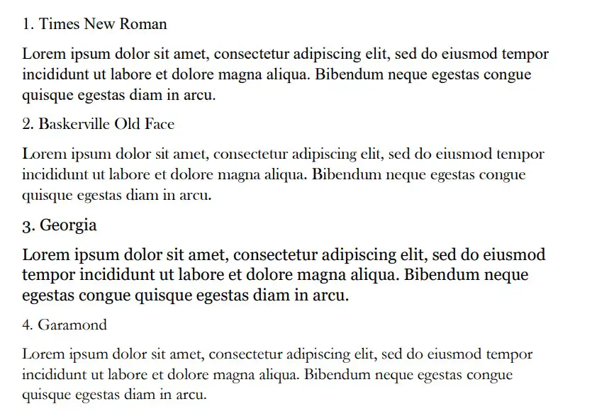
The best fonts for academic papers are Times New Roman, Baskerville Old Face, and Georgia. There are plenty of good options, but you’ll mainly want to stick to serif fonts. They look much neater and more professional while showing that the reader can trust what you say.
Times New Roman
Times New Roman is the most famous font on Microsoft Word. It should come as no surprise that it’s a good pick when writing academic papers. It’s got everything you could possibly need when it comes to professionalism and readability.
Times New Roman is the best font to use in most situations. If you’re looking for a more formal font, you’ll find that Times New Roman ranks very highly on the list, regardless of what else is required.
It’s a fairly small font, which looks more appealing for an academic paper. A common pitfall that most people fall for is they try to use a font that’s too large, which can make their paper look less trustworthy and more informal. Neither of those traits is good for academics.
Baskerville Old Face
Baskerville Old Face is a great font to use in an academic paper. There have been studies in the past about different fonts and how they engage readers. It’s believed that Baskerville is one of the most reliable fonts, and the writer tends to be more “truthful” when using it.
Whether you buy into studies like this or not isn’t important. What is important is that Baskerville Old Face is a fantastic choice for most academic papers. It looks really good (like a more concise Times New Roman), and it’s very popular.
Baskerville is a fairly popular choice for published novels, so you might already be familiar with the font style. If you like the way it looks in some of the novels or publications you’ve read, you’ll find that it converts very well to your academic papers.
Georgia
Georgia ranks very highly when looking for a formal font that will work well in an academic paper. It’s slightly larger than Times New Roman, but a lot of people say that this helps it to become a more “readable” font.
When writing academic papers, it’s wise not to overwhelm your reader with information. The more condensed the font is, the harder it can be to make sense of what you’re writing. With Georgia, this isn’t an issue.
Georgia might be one of the larger fonts listed here, but it makes for an easy read. Plenty of readers will be happy to read through an entire paper written in Georgia, but they might be a bit against reading one in something smaller.
Garamond
Garamond is another decent option that can work well for academics. Garamond is the smallest font we have included on the list, which can allow you to get a lot of information into a very small space without overwhelming a reader too much.
While it’s not always ideal for including lots of information, Garamond does it really well. It’s readable and professional, allowing your readers to make sense of even the most concise explanations you might include.
It’s also quite a popular choice for many writers. You’ll find that it ranks quite highly simply because of how popular it’s become among a lot of writers on Word.
Cambria
Cambria is a solid font choice that a lot of people like to use. It’s another default font (though it’s mainly reserved for sub-headings in most Word formats). It runs true to the font size, making it a fairly decent choice if you’re looking for something compact.
The serif style of this font makes it easy to read. It’s nearly indistinguishable from some of the other more popular serif fonts like Times New Roman and Georgia, which is why it is such a popular choice.
However, since it looks so similar, it can make it difficult for people to recognize the font or to figure out which font you’re using. While this isn’t the end of the world, it certainly won’t help you to create a unique feel for your paper either.
Book Antiqua
Book Antiqua is another suitable serif font. It’s not as popular as some of the others, but it looks really good as far as formal fonts go. People like it because it offers a slightly more authentic feel and looks like it could be used in a published novel or academic study.
It’s a standard-sized font, and it’s quite easy to read. A lot of people enjoy using it because it can offer a lot of character to their writing. You might not think that a font has that much power, but you’d be surprised once you try and use Book Antiqua a bit more.
Bookman Old Style
Bookman Old Style is another good font that can look like something out of a published paper. What makes this one special is its size. It’s quite a large font with a decent amount of width to each letter (without going too overboard with the letter spacing).
This font is quite popular for people looking to make their academic papers stand out. It’s not the same style as most of the other serif fonts, allowing your paper to bring a little bit extra that some other people might miss out on.
We encourage you to try this one in multiple different situations. It can work both formally and informally, depending on what you’re looking to get out of it.
Palatino Linotype
Palatino Linotype is a good font for many occasions. You’ll often find it used in academic papers because of the interesting style that comes with it. It looks like a classical font, which takes inspiration from some of the older styles of writing that came before computers.
If you want your academic paper to come across as a bit more traditional or formal, you’ll love this font.
Palatino Linotype offers a great deal of character without changing too much of the original formula that makes fonts like Times New Roman and Georgia so special.
Lucida Bright
Lucida Bright is a great font that is very large compared to most. It works well in academic papers, but you’ve got to make sure you know when to use it. If your paper is particularly word-heavy, it might not be wise to use a font that makes each word much larger.
For example, if you have a page limit on your paper, it might be wise to use a smaller font. Lucida Bright will definitely carry you far over that page limit before you come close to the words you might need to use to explain something.
Nevertheless, it’s still a very attractive font that looks really good in most academic papers. If you’re looking for something that’s stylish and readable, Lucida Bright is a good option.
Calibri
Calibri is a sans serif font, and it’s the first of its kind on the list. We have only included serif fonts because they tend to be more readable and professional. However, Calibri can work really well if you’re looking for a slightly more approachable feel with your font.
Calibri is like the Times New Roman of the sans serif fonts. It is very popular, and most Microsoft Word versions come with it preloaded as the default font for most written pieces.
That’s what makes it such a valuable choice. You can use it in almost any situation (informal and formal) to a great degree.
Arial
Arial is another popular sans serif font that you will be able to use in your academic writing. You don’t always have to use the more formal serif fonts, and Arial is a great example of what can be achieved when you’re a little less formal with your presentation.
Arial is much larger than Calibri when the same font size is used. This makes it a lot more visually appealing, though you have to make sure you don’t overdo it with the number of pages it uses.
Before Calibri replaced it, Arial was also the default sans serif font on Microsoft Word. This has allowed it to be a fairly popular choice for many users, and it remains one of the most popular ones today.
Century Gothic
Century Gothic is the final font we want to cover. It’s a sans serif font that can work really well if you’re looking for a slightly larger font. It’s larger than Arial, making it an easy-to-read font that a lot of people like to utilize.
The only issue you might come across is that the size of it can make it seem much more informal. You should be careful with how you use this font, as it could take away from the professionalism or reliability of your academic paper.
You may also like:
12 Best Fonts for Notes in Microsoft Word
12 Best Victorian Fonts in Microsoft Word
12 Best Chalkboard Fonts for Microsoft Word