Note-taking is something that a lot of people do when they’re trying to scribble things down hurriedly. If you’re taking notes in Microsoft Word, it will help to know which fonts will be the clearest. This article will explore some of the best note fonts.
Best Fonts for Notes in Microsoft Word
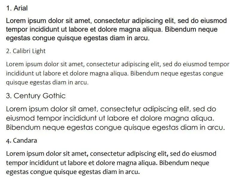
The best fonts for notes are Arial, Calibri Light, and Century Gothic. These fonts are sans serif, making them much more concise when you’re trying to read notes that you might have scribbled on a Word document. They work well when trying to remember what the notes were for.
Arial
Arial is one of the best fonts in Microsoft Word, and it used to be the most popular default font. It’s a solid choice if you’re looking for something that’s going to be easy to read once you come back to your notes at a later time.
One of the biggest problems with note-taking is that it can be easy to forget what you took the notes for. While the information is fresh in your mind, you might use little words to try and remember larger things.
Once you come back to those little words, it can be difficult to remember exactly what larger piece of information it was supposed to connect with. That’s why fonts like Arial help out. They present themselves in a much clearer manner, making them more suitable on most note pages.
The size of Arial also helps it to stand out on the page. Compared to most of the fonts at a similar size, Arial is one of the larger ones that looks good regardless of the font size you choose.
Calibri Light
Calibri Light is another great font that works for notes. It’s sans serif, making it slightly easier to read when you’re skimming through the pages. It’s also a lot smaller than Arial, allowing you to fit more notes into a smaller space on your page.
If you don’t like your notes to take up entire pages, a small font like Calibri Light might be better suited for your needs. It’ll help you to get the most out of your note-taking without feeling like your words are taking up too much space.
Compared to most of the other fonts, Calibri Light is one of the smallest. It’s also one of the most popular because it’s part of the Calibri family, which is currently the default sans-serif font family on Microsoft Word.
Century Gothic
Century Gothic is a great font that comes in as the largest on this list. Even at size 12, it’s really easy to tell what you’ve written if you’ve used Century Gothic for your notes. Its size helps anybody to make out what you’re trying to include in your notes.
It’s also much more informal, which can work well in many situations. While formality isn’t at the forefront of importance when you’re taking notes, it can still help to use an informal font to make your notes appear more “approachable” or friendly.
The letters in Century Gothic are also thinner than most of the letters in the other fonts. This usually aids the reader’s comprehension when multiple words are written within the same line.
Candara
Candara works really well, and it looks very similar to Calibri Light. It’s another small font, though the lines are slightly thicker, meaning that you might find fewer words can be included per line compared to Calibri Light.
The thickness of the lines makes Candara slightly easier to read from a distance. Also, having fewer words per line generally allows you to make your information more readable without worrying about overwhelming the reader with all the notes you’ve included.
It’s not a particularly popular font. Not many users know about it, but it’s definitely worth looking into to see if you can get it to work well in your notes.
Gautami
Gautami is a good choice if you’re looking for a solid note font that has a little bit of everything. It’s not too big or too small. Neither is it too thick or too thin. It’s just right if you’re looking at it compared with all the features that the other fonts might have.
If you’re looking for the perfect middle ground, Gautami is definitely up there amongst some of the best. You’ll find that it works really well in many situations, but it can be a really good note-taking font if you’re looking for something that’s easy to read on the page.
It’s not all that well-known, though, which is a negative. Most people don’t know about the font, and they would prefer to use more common or famous ones like Arial or Century.
Mangal
Mangal is another great font that looks very similar to Arial in many ways. You can use it as a sans serif font to show that you want your notes to be easy to read. If you’re passing your notes to someone else, a font like Mangal will make their lives much easier.
You’ll find that the font size is fairly average. It might come up a little bit larger than most, but it’s closer in size to something like Arial rather than the smaller fonts like Calibri Light.
Lucida Sans
Lucida Sans is a great choice that’s part of the Lucida font family. The Lucida font family is one of the most popular families of fonts on Word. It works really well in many cases, and there seems to be a Lucida font for just about every occasion.
You will find that the “Sans” style is the best style for your notes. “Sans” means sans-serif, which is the same style as all the other fonts on this list. It doesn’t rely on the extra formality of serifs that come with some fonts like Georgia or Times New Roman.
It’s quite large in size as well, making it a great choice if you’re looking for something that’s easy to read back through at any point.
Quire Sans
Quire Sans is a great font that you can use. It’s not very well-known, but it has a unique sans-serif style that can set it out from the rest of the fonts here. It allows you to present your notes in a clear and concise way, which is ideal in most cases.
The most distinct feature of Quire Sans is the style of the letters that come under the line. Letters like “Q” and “g” showcase the uniqueness that might come with Quire Sans.
Tahoma
Tahoma is another solid choice. It’s a good sans-serif font that’s quite a popular choice for most web pages, so you’re probably already familiar with how it might look. It’s very similar to Arial in a lot of ways, though the letters are slightly narrower.
Since it’s a popular web page font, Tahoma is also used quite a lot in Microsoft Word. If it’s used in one area, it’s often common to see it used elsewhere once people start getting more familiar with it and how it looks.
For note-taking, it’s going to help you understand more about what you’re writing. It’s a great way of including a lot of condensed information without worrying about what you’re trying to say.
Verdana
Verdana is another common web page font that gets a lot of usage on Microsoft Word. You can use it to make your notes slightly easier on the eye. It’s a bit larger than Tahoma, and the spaces between the letters are slightly more pronounced, making it easier to read.
Verdana is always going to be a mainstay font on Microsoft Word. A lot of people like using it because of how familiar it looks (considering it’s used in many areas of the internet).
While it isn’t as popular as choices like Arial or Calibri Light, it still gets plenty of use. You might want to try it for yourself to see if you like the look of it.
Gill Sans MT
Gill Sans MT is part of the Gill Sans font family. It’s a decent choice that comes in a little smaller than most of the other fonts. You can use this when you’re looking for a slightly bolder look to your notes.
Some people prefer reading fonts that look bolder. The boldness can help people to work out what you’re trying to say with your notes with little to no effort on their part.
If you haven’t tried a Gill Sans font before, it’s definitely worth it. You might be surprised by what you can get from it.
Corbel
Corbel is not a very well-known font, but it can work really well for notes. It’s much smaller than most of the fonts, but the squareness of the letters makes it much easier to read relative to its smaller size.
It’s much closer in size to fonts like Candara or Calibri Light. However, it does offer a slightly different feel in the shape and style of the font, which can help certain note-takers to understand more about what they were trying to say on their note pages.
You may also like:
12 Best Victorian Fonts in Microsoft Word
12 Best Chalkboard Fonts for Microsoft Word
12 Best Serif Fonts in Microsoft Word