Sometimes, you might find yourself writing an essay, but your words aren’t taking up nearly as much room as you might hope. That’s where it pays to know what the largest fonts at size 12 can be that are also attractive. This article will explore the best ones for essays.
Largest Fonts in Microsoft Word
The best largest fonts for essays are Arial, Century Gothic, and Verdana. These fonts look the part while also providing you with a chance to make them slightly larger. Your essays will end up looking much more complete with these fonts.
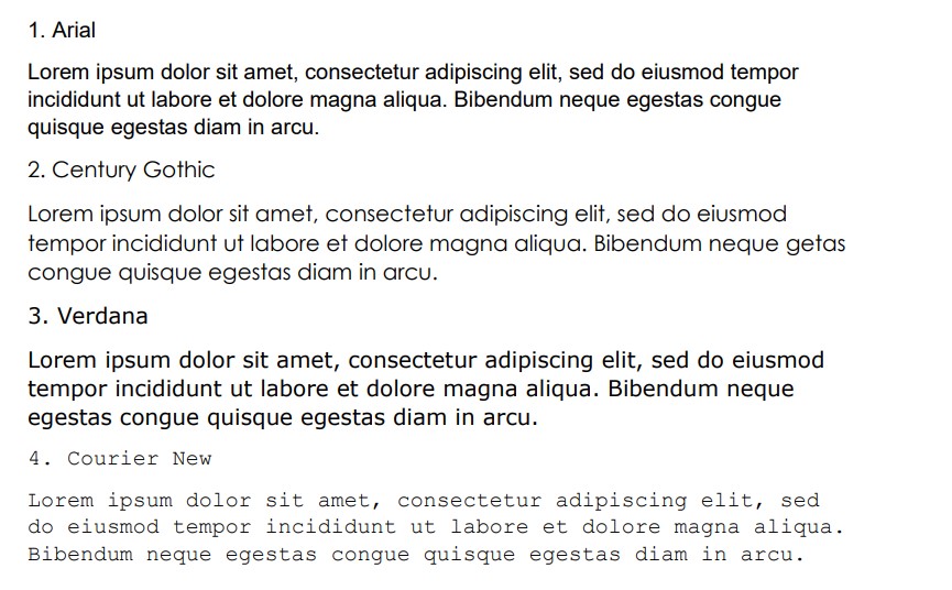
Arial
Arial is one of the most popular fonts in the world. It was once the original Microsoft Word font, making it a solid choice that’s easily recognizable. Compared to some other standard fonts (like Times New Roman and Calibri), Arial is certainly large enough to make your essay look longer.
The best part about Arial is how common it is. Since it’s so popular, no examiner or reviewer will bat an eye when you decide to use it for your essay. It’s not like you’ll be deliberately trying to cheat the system and make your essay look bigger than it is.
Realistically, Arial has a lot going for it, and many people prefer it over other fonts. It’s by far one of the best large fonts you can use on Word.
Century Gothic
Century Gothic is a great font if you’re looking for a large one in size 12. It’s a fairly popular choice, and it’s also attractive enough to help make your essay look professional. It’s even larger than Arial, though it’s not as commonly used.
Century Gothic is one of those fonts that you simply have to try to find out whether you like it. It offers a great deal of versatility, and it can look really good as the main font in your essay.
A lot of people enjoy the look of Century Gothic. While it might be slightly more obvious that you’re trying to use a larger font to make your essay appear longer, it is still a suitable option that will help out.
Verdana
Verdana is a very wide font that looks really good. It’s very readable, and a lot of people use it for their web pages to help people navigate through what they have on offer. It’s a very popular font choice, and it’s worth looking into.
Verdana bridges the size gap between Arial and Century Gothic. It’s slightly larger than Arial due to its width, but it’s not quite as obviously large as Century Gothic. Some people argue that this makes it the ideal font to use when you’re trying to pad out an essay.
It’s also very recognizable. Like Arial, Verdana is a great choice that would look innocent if used as an essay font. It doesn’t make it look like you’re trying to make your essay longer.
Courier New
Courier New is a bit more obvious than some of the other fonts if you’re looking to make your easy longer. It works really well because of the width that comes between each letter. However, if your essay is particularly long, this could have an adverse effect.
Courier New is so wide that an essay longer than 1,000 words would take up way too many pages. The examiner would know that you’re trying to get out of writing more words by using a larger font, so you need to take this into account.
Lucida Sans
Lucida Sans is a great font choice that a lot of people overlook. It’s simplistic and professional, which is exactly what you’re going to want to see when you’re creating an essay. It’s one of the bigger fonts that meet all the criteria you’re looking for.
Lucida Sans is part of the Lucida font family, which is a fairly popular choice on Microsoft Word. There are plenty of subsets to this family that can work well, but Sans is the best choice if you want a larger font for your essays.
Franklin Gothic Medium
Franklin Gothic Medium is a decent choice if you’re looking for something that’s going to be able to size up your essays slightly. At size 12, it’s a very similar size to Arial. It is made slightly larger by the fact that the font is slightly bolder.
Don’t worry; this boldness won’t take away from the impact of your essay. It’s just a subtle way for you to be able to add more pages while keeping the word count roughly the same.
Next, we’ll move on to look at the actual largest fonts in word and not just the ones suitable for an essay.
The best largest fonts in Microsoft Word are Goudy Stout, Ravie, and Wide Latin. All of these fonts are spectacular in terms of size. No other size 12 font comes close to how much these fill up a page. Of course, they’re much more informal than the essay fonts.
Goudy Stout
Goudy Stout is the largest font. It’s a great font choice if you’re looking to use it in a title. We don’t recommend using it in the main body of the text, but it’s certainly eye-catching as a title font.
As far as title fonts go, Goudy Stout is one of the most popular ones on Word. It has everything that people look for when they’re trying to come up with a visually attractive design for their work.
Every letter is capitalized (even if you write them in lower case). Some people like this feature, while others might try to avoid it. If you enjoy upper-case fonts, then Goudy Stout is probably going to be a good one for you.
Ravie
Ravie is the next largest font that you’ll find on Microsoft Word. It’s a fairly popular choice that comes with a bubbly and energetic style. A lot of people like the randomness to the curls and flicks that Ravie seems to contain in its lettering.
In terms of character, Ravie is one of the most popular font styles. It seems to bring its own life to the page, which makes it an excellent choice when you are using it at any font size.
Like most large fonts, Ravie will do better in the title rather than the body of the text. Nevertheless, it’s still a decent choice if you feel like writing with it in your document. Just remember that it runs slightly larger than your chosen font size.
Wide Latin
Wide Latin is, as you might imagine, wide. It’s a very large font that runs across the page. Each letter is almost twice as wide as any of the other font styles on this list, making it a very large font compared to the others.
On top of the width of Wide Latin, it also comes with a decent amount of height. When it’s written in a simple size 12 font, Wide Latin still stands out as one of the largest on the page (not just because of its width).
People like using Wide Latin for titles because of how the spacing between the letters looks. It’s not the best for the main body of the text because you’ll find that the width limits you to only writing a handful of words per line.
Castellar
Castellar is a great font choice that many people like to use in their writing. Though it might not be as bold (or loud) as some of the other fonts on this list, it’s still a surprisingly large one when you compare it to others at the size 12 font.
Castellar is the least visually-striking font in terms of boldness. You’ll have to be closer to the document to read it in the lower fonts because the letters come across as quite thin.
Nevertheless, it’s still potent enough to capture people’s attention. It also stands taller than most fonts at the same font size, making it an excellent choice if you’re strictly looking for some of the tallest fonts on Word.
Showcard Gothic
Showcard Gothic is a great font that works well in many font sizes. It’s a title font (we don’t recommend it in the main body of the text) because of its thickness and size. Every letter is a capital letter with a bit of a bubbly personality to it that other fonts lack.
Many people like to use Showcard Gothic for their titles. It works really well informally when you’re trying to introduce people to a party or event that you think will be a lot of fun.
Rockwell Extra Bold
Rockwell Extra Bold is in this list because of the “Extra Bold” portion in the name. It’s a fairly large font, but most of the size comes from the width of the letters when the boldness is added.
The base font of Rockwell wouldn’t make this list. It’s not as appealing as Rockwell Extra Bold, and it doesn’t come across anywhere near as large in most documents.
Rockwell Extra Bold is a very popular font choice, and it works well for both titles and main text bodies. It’s up to you to determine where you would rather use a font like this.
You may also like:
12 Best Harry Potter Fonts in Microsoft Word
12 Fonts That Look Like Children’s Handwriting in Word
5 Best LaTeX Fonts in Microsoft Word