Children’s handwriting and adults’ handwriting often don’t look similar (though they can do in some cases). It might help to look into some children’s handwriting fonts that you can use in Microsoft Word. They will allow you to replicate the messiness of most children’s writing.
Fonts That Look Like Children’s Handwriting in Microsoft Word
The best fonts that look like children’s handwriting are Kristen ITC, Bradley Hand ITC, and Ink Free. The key to fonts for kids in Word comes from messy or hurried styles. These three fonts are some of the most readable ones that are also “messy” as part of their style.
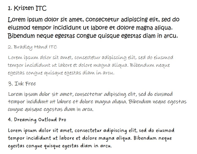
Kristen ITC
Kristen ITC is a fantastic choice if you’re looking to replicate children’s handwriting. It’s neat enough to be easy to read, but it’s large and messy, just like you would expect from a child writing anything on a piece of paper.
Kristen ITC is a surprisingly large font. If we had to compare them, it’s easily the largest font on this list. In terms of children’s handwriting, size matters. After all, most kids write very large letters, and it’s once they learn better pen control that they make them smaller on the page.
It’s also a very popular font that a lot of people like to use. Since it’s easy to use and large, it makes for an effective font in the middle of your document. It’s good for both titles and the main body of the text, depending on what you require it for.
Bradley Hand ITC
Bradley Hand ITC is another good font that plays on the handwriting that children might work with. It’s a good one that allows you to be a bit messier than standard fonts (like Times New Roman or Arial). It’s still very readable, which makes it ideal for many users.
Bradley Hand ITC is up there as one of the most popular handwriting fonts. It doesn’t just have to apply in the context of kids, though it’s very useful to do so.
There’s slight messiness present with the thin letters that come from Bradley Hand ITC. This messiness is what you might attribute to a teenager of some kind. Calling this a children’s handwriting font might be a step too far.
Ink Free
Ink Free is another great font that plays into the slightly hurried look of a child’s handwriting. It works really well because of the fairly large gaps that are present between each letter. It looks almost identical to how most children learn to write.
While it doesn’t come with the complete messiness that most children have when first learning, it still looks like the writing of a child who might have been learning for a few months.
The size of the font is what makes Ink Free most effective here. It’s in a similar size and style to Kristen ITC (though not quite as large). That’s why so many people enjoy using it when they’re trying to replicate the writing of a child.
Dreaming Outloud Pro
Dreaming Outloud Pro is a cloud font on Microsoft Word that you can get to really create the theme of children’s handwriting. The biggest part of this one comes from the spacing between the letters and the bubbly bold look they have going on.
Dreaming Outloud Pro looks like a child has been given a pen after passing their pencil-based handwriting tests. They don’t quite understand how the thickness of a pen differs yet, so they press really hard and get bold lines.
That look is what makes Dreaming Outloud Pro so authentic to many users. It also makes it visually attractive as both a title and as the main body of the text, depending on where you want to use it.
Modern Love
Modern Love is a good font that looks messy on the page. It’s a solid choice that many people like to use to try and create a child’s handwriting. The thick style of this font sets it apart from the rest on this list.
While most of the other fonts look more like they’re written with a pen or pencil, Modern Love looks like it’s written with a black marker or a thin paintbrush. The thickness of the lines is what really brings this one out.
With kids’ handwriting, it’s common for letters to be uneven and sit above and below the line they’re trying to write on. Modern Love manages to do exactly that with the font, making it a solid choice in most cases.
Segoe Script
Segoe Script is a decent choice if you’re looking for a messy kids’ handwriting font. While it is a calligraphic font of sorts, it looks really good when you’re trying to show that it might be a child who is trying to learn calligraphy for the first time.
It’s nowhere near as fine-tuned as some of the other calligraphy fonts. It looks really good because of how the letters connect with each other, but you would be able to tell that a child has attempted to write in this style rather than a skilled adult.
Segoe Script is also part of the Segoe font family. This is a fairly popular font family in Word, making it a popular pick when looking for fonts that do the job well.
Rage Italic
Rage Italic is the pinnacle of fonts that look like a child could have written it. It looks rushed and “angry” almost. It’s as if a child is getting frustrated at the page while trying to write in a way that’s neat enough for people to read.
Rage Italic is a calligraphy font of sorts. This automatically means that a young child wouldn’t be able to write like it. However, if you’re talking about an older child (like a teenager), then you might be able to say that Rage Italic is a good choice for them.
Pristina
Pristina is similar to Rage Italic in that it looks rushed. It also looks more like a teenager might have created this font rather than a young child.
It’s a good choice to show that someone isn’t as neat as they can be while showing that it might be a child’s first attempt at “neatness.”
Pristina is a fairly popular font choice as well. You’ll often find that people use it in both titles and the main body of the text, depending on which works better for the theme of their document.
Freestyle Script
Freestyle Script is a solid choice if you’re looking for a handwriting font. This one is fairly neat, and many people would attribute it more to adults than children. Nevertheless, it’s still a decent choice if you’re looking for a somewhat rushed writing font.
Freestyle Script looks rushed because of the italics it’s written in. While it’s much neater than some of the other choices, this rushed look is what allows it to be considered a children’s handwriting font.
It’s also quite popular, and a lot of people like to use it as either a title or in the main body of the text. If it was slightly messier, it would be one of the best fonts on this list, and it would rank much higher.
Informal Roman
Informal Roman follows a similar idea as Freestyle Script. It’s a generic handwriting font that plays into the hurriedness that some people have about their writing. It isn’t strictly related to children’s handwriting, but it can be effective at trying to create this.
The italics in Informal Roman are slightly less pronounced than in Freestyle Script. The key difference comes from the serif style that Informal Roman presents. You can think of Informal Roman as the informal, handwritten variation of Times New Roman.
It’s not all that popular, but it definitely deserves to be noticed more. People enjoy looking at this font, but it’s not one that commonly goes through someone’s mind when coming up with a good font for their document.
Viner Hand ITC
Viner Hand ITC is another good handwriting font, but it doesn’t really apply to children all that well. We included it because of the slight messiness that’s present. If you think of it as a child’s handwriting, it’s likely that the child is very gifted at writing.
If you are looking for a teenager’s handwriting font, then Viner Hand ITC is a great choice. It also looks really good for generic handwriting because of the thickness of the lines that replicate the pen or ink used to write it.
Juice ITC
Juice ITC can work well as a children’s handwriting font. It looks more like a font than handwriting, which makes it a bit of a low-ranker on this list, but it can still capture the same chaotic energy that is present in most children’s handwriting.
We didn’t include this one higher because it isn’t strictly a handwriting font. It’s just a messy font that can work really well as part of a title. We recommend giving it a go to see if it creates the visual effects that you’re looking for.
You may also like:
5 Best LaTeX Fonts in Microsoft Word
12 Best Military Fonts in Microsoft Word
12 Best Fonts for a CV in Microsoft Word