Microsoft Word comes built in with a lot of fonts, making it a great tool to help you design things in certain ways. This article will look into some of the spooky fonts in Word that you can use to create a bit of a Halloween theme in your designs.
Scary Fonts for Halloween in Microsoft Word
The best scary fonts for Halloween include Blackadder ITC, Curlz MT, Gigi, and Papyrus. There are so many great options out there, and each one is entirely dependent on the context or theme you’re looking for. If you’re looking for a spook, these fonts will help you out.
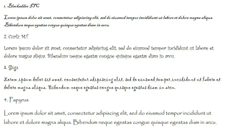
1. Blackadder ITC
Blackadder ITC is the first choice that will help you get a spooky feel in your writing. It is a thick, bold font that relies very heavily on careful flicks and droops that add a bit of elegance to your writing.
Now, you might think that elegance isn’t what you’re looking for when writing for Halloween but think again. If you can create something with this font, it’s going to look like some kind of menacing presence is trying to communicate with the reader.
The elegance is just enough to be scary without being too much that it seems too formal or posh. This will work really well when you’re creating an invite for a Halloween party or sending a false warning to your neighbors about ghosts and ghouls that might be on the hunt.
2. Curlz MT
Curlz MT is a bit of a specific choice. We’re not saying that this will work in every spooky context, but it certainly comes with the curls and droops that one might look for when they’re trying to present their writing in an interesting and scary way.
If you use your imagination a bit with this one, you’ll be able to come up with very interesting presentations. Most people put too much emphasis on fonts that bleed or have teeth for Halloween, and those are often overdone.
Being able to use Curlz MT for a Halloween presentation is a great way of showing that you have a better grasp of fonts in your writing. It shows that there’s something really scary about what you’re writing rather than just relying on the font style to invoke fear.
3. Gigi
Gigi is a very popular font across the board. It’s one of the most common font choices that isn’t a standard serif or sans serif choice (like Times New Roman or Arial). It offers a lot of spooky factors that most people capitalize on when they use it.
You might be able to notice a slight trend with this one. Again, it comes in with a few curls and spirals that allow you to pretend like you’re presenting something with elegance.
This is a great way of showing that you have something interesting or spooky that might be worth looking into. Who knows who you might be able to attract when using a font like this to entice them.
4. Papyrus
Papyrus is a solid choice for themed parties and events. It relates to the way ancient civilizations used to write on papyrus (thin pieces of paper). It’s a very soft font, with long capital letters and droops in letters that hang beneath the line.
While it doesn’t strictly say “spooky” or “Halloween,” it is another choice that allows you to add something interesting to your tone. Sure, most people overlook it, but if you’re theming your party around something specific, it’ll work wonders for you.
For example, imagine if you’re having an Ancient Egyptian-themed Halloween event. Papyrus is by far the best font choice here. It relates to the civilization and to the mummies that might have once written on the papyrus.
5. Parchment
Parchment is another font name that comes from writing on specific types of paper. While this one doesn’t work in the same contexts as Papyrus, it is still a great choice if you want to make it look like something official has happened that’s led to a Halloween event.
As an example, let’s say you’ve created a “Wanted” or “Bounty” poster for a Halloween party. Parchment is by far one of the best choices to use to really capture the idea of the wanted poster.
It’s a fairly popular choice, and most people make it work in many other situations. We don’t want to give too much away. If you’re looking for a good Halloween option, you should give this one a try!
6. Snap ITC
Snap ITC is everything that people look for in a Halloween font. It’s loud, bold, and comes with little jagged edges. When the letters come to an end, Snap ITC “snaps” them out to show that they’ve been hastily scribbled.
It’s a great choice because it comes with the exact theme that people look for in most Halloween events. It’s a great way of enticing people into whatever you’ve got planned.
It’s certain to be received as a spooky one if you use it right.
7. Viner Hand ITC
Viner Hand ITC is a good choice for most Halloween writing. It is a strong font that has different letters dropping below the line (like the letter “d” in the lower case).
This idea of bringing some lines below the type line is a common choice for people looking to spook in their writing.
Unfortunately, Viner Hand ITC isn’t all that well-known. Not a lot of people use it because they don’t know about its existence. That’s the issue when Microsoft Word lists its fonts in alphabetical order, and Viner begins with a “v.”
Generally, unless someone else has told you about it (like this article), you’re not going to know about Viner Hand ITC. Still, we highly recommend you try it if you want to be a bit more spooky.
8. Castellar
Castellar is a great choice that almost looks like it outlines the letters you type. The letter itself can be seen inside very thick, black frames that allow you to pronounce them a little easier and set them apart from the rest of the page.
The intensity of this font is what makes it a valid choice when it comes to spooky writing. It allows you to show that something is important to read. You definitely won’t want people to miss out on whatever you might be writing about.
9. Algerian
Algerian is a very similar font to Castellar. The main difference comes from Algerian being much thicker than Castellar. Only a handful of the letters retain the small empty lines in the middle of a thick, black frame.
The letters that don’t retain the lines are instead replaced by bold letters that are nearly impossible to miss. This is what makes it such a powerful choice for most people when it comes to writing spooky things.
In many contexts, Algerian is a great way of being spooky to those reading your work. And above all, it’s certainly going to capture their attention with how big it can be.
10. Engravers MT
Engravers MT is large, and sometimes that’s all you need. It’s got everything that people look for when it comes to a loud Halloween font. If you want your presentation or writing to be seen, you will find that Engravers MT is going to help you with that.
Some people argue that Engravers MT doesn’t have much else going for it. While this may be true in some situations, we refer you back to what we’ve said before about how dependent on certain contexts most of these fonts tend to be.
If you can write about something that deserves someone’s attention while also being spooky, Engravers might just be the answer.
11. Magneto
Magneto is a great way of being spooky. It’s a very harsh font that plays into the cursive side of writing. While cursive writing is often more traditional and regal, Magneto opens that up to a more spooky theme.
Its bold face allows you to create something that’s striking and spooky at the same time. You can’t miss it when you walk past something that has Magneto on the front of it.
It’s attractive in all the right ways, and it provides plenty of options for people looking to spook their friends.
12. Ravie
Ravie is a very interesting font for many people. It’s erratic and almost doesn’t seem to follow its own rules. The letters are all over the place. Some of them will sit on the line, and some will be just above or just below.
This craziness is exactly what people look for when they’re trying to be spooky. There is no sense of order or control in your writing when Ravie is used.
Instead, it shows that nobody really knows what’s going to happen next. It’s a very popular font choice for many people. You’ll have a lot of success using Ravie in your writing, as long as you’re not advertising or presenting a Halloween event that might be a little more formal.
As far as tone and formality go, Ravie is one of the best choices for informal writing.
You may also like:
12 Cute Fonts in Microsoft Word
12 Best Handwriting Fonts in Microsoft Word
12 Best Typewriter Fonts in Microsoft Word