Everyone wants to have specific fonts said aside for certain contexts and themes. Pretty fonts in Microsoft Word are a great example of this. Everyone wants to have something cute and pretty at the ready. This article will help you to understand some of the best ones.
Cute Fonts in Microsoft Word
The best cute fonts in Microsoft Word include Bradley Hand ITC, Curlz MT, Forte, and Ink Free. There are many great choices, but almost all of them are subjective. These ones should cover what most people associate with a cute font.
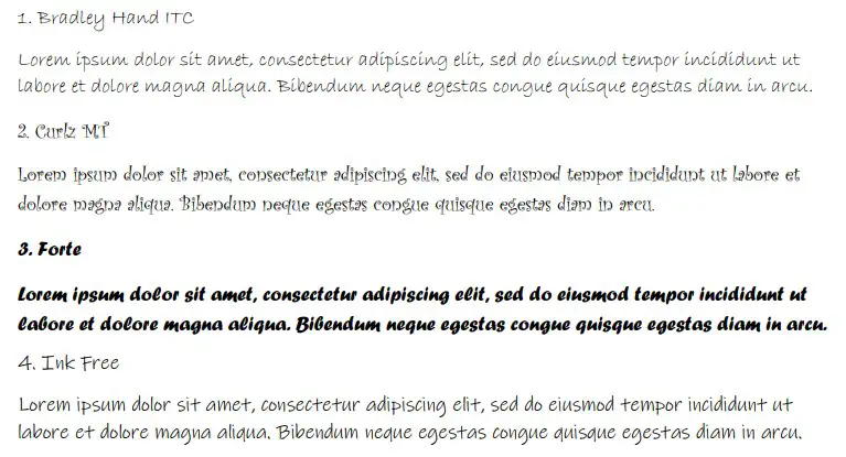
1. Bradley Hand ITC
Bradley Hand ITC is cute because of how the letters look. They are thin and attractive, making them a good choice for people looking to make their writing prettier. There’s also a subtlety about the font that other fonts miss, where the letters fade out at the bottom.
Bradley Hand ITC is a common choice for many people when it comes to being cute. It works well because it’s easy to read, and it has plenty of space between each letter within a given word (making it very comprehensible).
It also suits plenty of different contexts. You’ll find that Bradley Hand will fit into almost any situation.
2. Curlz MT
Curlz MT is a bit of a noisy font. If you like your cute fonts to have a bit more character about them, then Curlz MT is by far one of the best. The “curlz” in the name relates to the curls and spirals that you can find in the letters (mainly the capital letters).
Curlz MT is a bit more specific in its usage than Bradley Hand. You’re going to want to make sure you find a suitable place to use it. You certainly won’t be able to get away with putting it anywhere.
Some people do find it unattractive, but that mostly comes from people who prefer more formality and less “cuteness” in their writing. If you’re looking to present something in a cute and striking way, Curlz MT is always a good selection.
3. Forte
Forte is a cute font that comes with a bold, bubbly look. Many people like how this one looks on the page because of how bubbly and readable it can be. It looks very informal, which is what you’re looking for when you think about cute things and how they work.
You will be able to use Forte as a presentation font above anything else. We don’t recommend using it as part of your formal writing, though it will look very pretty on a poster (as long as that’s the intended effect).
4. Ink Free
Ink Free is a great choice if you want a cutesy font. It works really well and looks attractive on the page. Many people enjoy it for its simplicity, and it helps that it’s definitely one of the easiest fonts to read.
Ink Free is a very popular font that a lot of Word users make the most of. It is very stylish and distinct with how it approaches its lettering.
The lines are just the right boldness without being over the top. And there’s a slight overlap with some of the lines where the letters might cross over (just like if you were writing them with pen, i.e. capital “I’s,” “T’s,” and “F’s”).
5. Juice ITC
Juice ITC is an interesting choice because it plays around with the height and sizes of capital letters. For example, the letter “I” as a capital letter actually includes the dot above it, so it looks more like a lower-case “i.” It’s a cute addition that really adds character.
Juice ITC works really well because of its interesting take on style and capitalization. It looks special on a page, and it’s a great font that works really well in many informal situations.
6. The Hand
The Hand will almost always be on a list related to attractive, cute, and pretty fonts. It’s so simple in its design, yet it has managed to capture so many people’s hearts and imaginations. If you’re looking for something that’ll fit any cute theme, The Hand is your answer.
People like The Hand for its simplicity, but sometimes it can be overly simple. It can be quite difficult to read unless you write it in a bold format because of how thin the letters are.
If you can overlook that fact (or only type it in bold), then you’ll find that The Hand is one of the most attractive and exciting fonts on this list.
7. The Serif Hand ExtraBlack
The Serif Hand ExtraBlack is one of the subsets of the main font The Serif Hand. While all of the fonts are “cute,” ExtraBlack adds a boldness to the font that the others miss out on. This boldness makes it easier to read while also making it more informal and pretty.
The Serif Hand is a family of fonts that are often typed capitalized as part of the style. Every letter is roughly the same height as the last, giving it a really interesting feel that makes it stand out from some other options.
We wanted to share the ExtraBlack variation because it tends to be the more popular one. ExtraBlack means “extra bold,” so the lines are thick and easy to take in.
Without the ExtraBlack addition, The Serif Hand can be a bit tricky for some to read. The lines are very thin, so unless you’re writing in a font larger than 32pt, you’ll have to pay close attention to what it says.
8. Modern Love Grunge
Modern Love Grunge might not sound like a particularly cute font, but it certainly meets all the criteria. It works well because of the “dusted” look that the letters have. There are small, white specs in the letters that give them a texture that most people deem as cute.
Modern Love Grunge also gets some cute points because of how the letters flow on the page. While the grungey texture is certainly alluring, the shape of the letters is also something that a lot of people are attracted to.
9. Modern Love Caps
Modern Love Caps is another type of Modern Love font. Unlike “Grunge,” “Caps” relies heavily on all of the letters being capitalized (whether you want them to be or not). This makes it a good choice for cute writing because it looks welcoming and friendly.
Capital letters can often look angry and shouty. Most people avoid them for this reason. However, Modern Love Caps gets them just right. They look almost enticing when they’re written in this way with this font.
While Modern Love Grunge and Caps come from the same family, there are enough differences between them to really set them apart. You should play around with both of them to see which one you might find cuter.
10. Calibri
Calibri is perhaps the simplest font on this list. It’s also the standard setting on most Microsoft Word additions today. It is still considered cute because of how simple it is. While it might be fairly basic compared to others, its cuteness comes from its simplicity.
Calibri is a standard font. There’s no doubt about that. But, you’ll often find that it’s used as the poster font for Word because of how attractive it looks.
After all, Microsoft isn’t going to pick an ugly font to be the default choice when you load it up. They’re going to want you to like the font that is used to save you having to change it later.
Since it is the default font on Microsoft Word for most additions, it is also one of the most popular fonts in the world right now.
11. Comic Sans MS
Comic Sans MS is hit and miss for many people. Many people dislike it because it has been overused for as long as it has existed. Many other people think it’s cute because of how it looks on the page. It’s said to be the “friendly” font that always looks welcoming.
Comic Sans is another incredibly popular font that most people would consider as a “default” option of sorts. It used to be much more popular than it is today, which is why it’s considered somewhat overused.
Nevertheless, if you want something that is fun and cute, Comic Sans is always going to be a solid choice.
12. Lucida Handwriting
Lucida Handwriting is a good choice because it looks like someone’s handwriting. Specifically, it looks like the handwriting of a younger person that’s trying to learn cursive. That’s mainly why people find it as cute as it is, making it a solid choice for this list.
People like Handwriting fonts because of how familiar they feel. You can type something up on Microsoft Word yet somehow still get it to look close to what it would look like if you wrote it with pen and paper.
For that reason, Lucida Handwriting gets a special mention. The character you can get from a handwritten font is unmatched. It is attractive to many people simply because it looks like they wrote it.
You may also like:
12 Best Handwriting Fonts in Microsoft Word
12 Best Typewriter Fonts in Microsoft Word
12 Best Christmas Fonts in Microsoft Word

Martin holds a Master’s degree in Finance and International Business. He has six years of experience in professional communication with clients, executives, and colleagues. Furthermore, he has teaching experience from Aarhus University. Martin has been featured as an expert in communication and teaching on Forbes and Shopify. Read more about Martin here.