Are you writing a christmas card in Microsoft Word? Well, maybe you’d like to know of some of the best fonts available to you to really capture the spirit of Christmas. This article will go over some of the best Christmas fonts in Microsoft Word to help you.
Best Christmas Fonts in Microsoft Word
The best Christmas fonts in Microsoft Word include Ink Free, Harrington, Informal Roman, and Juice ITC. None of these fonts have much in common, but they all introduce new and exciting ideas and themes that might work really well for your Christmas poster or presentation.
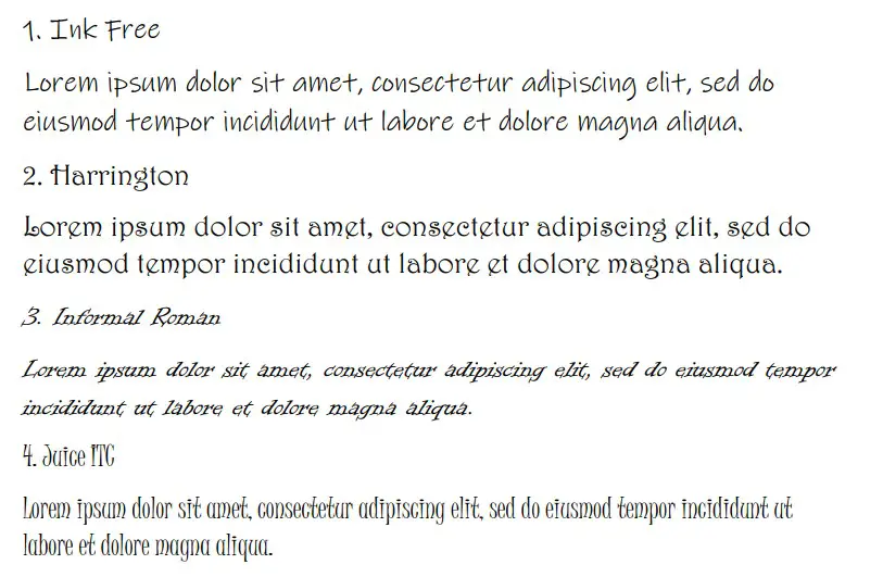
1. Ink Free
Ink Free is a great choice for most Christmas-themed documents. It’s great because it has a lot of character and it’s very informal. Many people like to use Ink Free because of how it looks on the page. It’s one of the most welcoming and friendly fonts out there.
Sure, there might not be any direct references to Christmas, but that’s hard to do when you’re using the standard Microsoft Word font lists. Instead, it’s better to look for fonts that capture the spirit or essence of Christmas that you’re looking for.
Ink Free is a great way of introducing your friends to a party you might be hosting. It’s a fun font, and it’s definitely eye-catching. On top of that, it’s very easy to read, and most people will enjoy looking at it because each individual letter seems to have its own personality.
2. Harrington
Harrington is another great choice for Christmas fonts. It is a very welcoming font that contains fancy, swirling lines within its letters. It can look really good when paired off with a good selection of Christmas colors and themes in your poster.
While it’s not as easy to read as Ink Free, Harrington is still a solid choice. It’s a favorite amongst most Word writers, and it’s one of the more popular fonts to use when presenting a poster in some way.
It can work both formally and informally, though we recommend that you use it for more informal parties and Christmas events. It is also slightly larger than most of the other fonts, making it really easy to read even if you’re standing away from it.
3. Informal Roman
Informal Roman is a lovely font that looks like it’s been scribbled out by a pen on paper. It works really well because it removes all the boring serifs that some fonts like Times New Roman might have. People don’t want to be bored by your font choice.
When it comes to presenting a Christmas poster, you’re going to want to capture someone’s attention. That’s why it’s always better to pick a font that really shows character or individuality.
Informal Roman is one of the best fonts to do this. It’s not all that well-known, but it’s a great option for anyone looking to entice their friends or colleagues into doing something fun for Christmas.
4. Juice ITC
Juice ITC has got to be one of the most interesting fonts on this list. It’s a great choice for most Christmas posters because of how unique it is. The letters all come with their own character and style while keeping a uniform look that makes it easy to read.
Juice ITC is a fairly narrow font. While it would look great as the main feature of your Christmas poster (like a title), it wouldn’t be as good if you’re using it as the main body of text. Narrower fonts can be harder to read if multiple words are next to each other.
Nevertheless, it’s still a very popular font. Many people like to use it because of how fun it looks. You’re going to have a really easy time grabbing people’s attention with this one.
5. Old English Text MT
Old English Text MT is a unique font that only works in specific circumstances. We recommend it as a Christmas font, but only if your Christmas-themed event is related to more old-fashioned Christmas fun and games.
The Old English theme is a common style for Christmas parties. It works really well and suits all the usual trends that most people expect.
It can be quite challenging to read, though, so you’ll have to be careful with it. It’s best to use it as a title because of how all the letters look. Don’t use it in the main body of the text because it will be nearly impossible to comprehend.
6. Pristina
Pristina is a solid choice if you’re looking for an interesting font to welcome into your Christmas poster. It looks like someone might have written it out themselves, which is always a welcome change from the standard computer fonts like Arial or Times New Roman.
Christmas posters need character, and people need to see that there is a human being behind the idea. Fonts like Pristina are the perfect way to show people that you have something interesting to share with them.
It’s a popular font, which makes it all the more useful. People use it all the time, meaning that it must be fairly easy to read no matter where you might include it.
7. Ravie
Ravie is a great font for a Christmas title. If you’re going to place your title in the middle of a poster, Ravie should be the only Microsoft Word font you need to look at. It’s big, energetic, and ready to party. That’s pretty much all you need to know about Ravie.
It’s a fairly popular choice for titles. It can be somewhat hard to read if it’s used as the main body of text, but it’s great if you’re only using it for a handful of choice words.
Ravie is also the largest font on this list. It will always run larger than the size chosen for the font, making it a very easy one to understand.
8. Vivaldi
Vivaldi is a good choice for specific situations. It looks like an old-fashioned quill and ink was used to create the font, but this is ideal if your Christmas theme is related to the past.
If you’re setting up a formal Christmas party with references to the past and traditions of Christmas, then Vivaldi is one of the best options on the market. You can’t go wrong with this one if you’re trying to capture the spirit of your party with a simple font choice.
We don’t recommend using this one for the bulk of your poster, though. One or two words are fine. An entire poster might be a bit challenging to read!
9. Viner Hand ITC
Viner Hand ITC is a handwritten font that is worth mentioning. It works really well for most Christmas posters because it looks like you have written it up yourself. While it’s not an exact replica of most people’s handwriting, it does a good job of coming close.
With handwriting fonts, one of the hardest things to do is to replicate the pen strokes of someone who is writing. You need to make sure you capture the thin lines and transition them into thicker lines (to simulate someone pressing their pen harder).
Viner Hand ITC does this really well, which is what makes it so attractive. It’s great to include as the main body of text in your Christmas posters to add a bit of character.
10. The Hand
The Hand is another great handwritten font that most people overlook. It’s a lot narrower and thinner than Viner Hand ITC, but it’s worth using if you can find a suitable way to include it in your Christmas posters.
Sometimes, narrower fonts can be hard to read. You’ve got to make sure you place The Hand properly if you’re going to include it in a Christmas-themed document.
If you use too much of it, people will have a rough time understanding what you’re writing about. It’s best to use it for titles or subtitles (basically, anything that doesn’t require a great deal of writing).
11. Bradley Hand ITC
Bradley Hand ITC is the last “Hand” font we want to run through. It’s good at simulating handwriting, which makes your Christmas poster a bit more interesting for most people to read. It will definitely welcome them a lot more than some other fonts.
Bradley Hand ITC bridges the gap between Viner Hand ITC and The Hand. It isn’t as thick as Viner Hand, but it isn’t as narrow as The Hand. It makes for the perfect middle ground between them if you don’t think that the other two are ideal for your writing.
12. Forte
Forte is a fun font that is bold and bubbly. It’s great for most Christmas posters because of how it looks. It will have no trouble capturing people’s attention, though we recommend that you use it mainly for titles rather than bodies of text.
Forte is a surprisingly popular title font choice. It works really well because it shows that you are fun and that the party (or Christmas event) you’re hosting will be fun too.
It’s also easy to read as a title because it is quite a large font. You will definitely have no trouble getting people to understand you.
You may also like:
12 Best Calligraphy Fonts in Microsoft Word
What Is the Disney Font Called in Microsoft Word?
12 Best Western Fonts in Microsoft Word