If you’re looking for a wild west font to suit a particular theme, you’ve come to the right place. This article will explore some of the best cowboy fonts or old west font styles available right now on Microsoft Word. By the end of this, you’ll have plenty of choices.
Best Western Fonts in Microsoft Word
The best cowboy fonts are Old English Text MT, Rockwell Extra Bold, and Baskerville Old Face. There are some great choices already available on Microsoft Word, and each one offers a bold theme that covers most of what people look for in the western fonts.
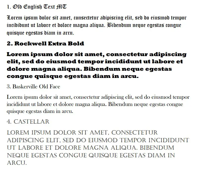
1. Old English Text MT
Old English Text MT is by far the best western font on Microsoft Word right now. The style of the font dates back to the old days. Specifically, it looks almost identical to the fonts you might find on “wanted” posters or other western posters that people might use.
The boldness and style of the font are what sets it apart from the rest. It’s a very popular choice for most people when it comes to creating old-fashioned posters. While western isn’t the only theme it applies to, it’s definitely one of the more popular ones.
On top of that, it’s a fairly large font that can be easy to read because of its size. It isn’t the most comprehensible because of the way the letters look, but it’s still a good choice if you want to make your writing easy to read.
2. Rockwell Extra Bold
Rockwell Extra Bold is one of the best fonts if you’re looking for readability. It is bold, striking, and comes with all the thick edges that people look for when trying to use a good cowboy font. It’s another contender that is seen a lot on makeshift “wanted” posters.
The bold lines and thickness to the bottom of the letters are what really puts this one into the western font category. It is a striking font that a lot of people like to look at. It also happens to be one of the most popular ones on this list.
On top of that, it’s really easy to read. It’s bold and runs quite large compared to the chosen font size. If you include this in a western presentation of any kind, you’ll find that a lot of people have no problem reading it.
3. Baskerville Old Face
Baskerville Old Face is another classic font that can work well. It’s nowhere near as bold as Rockwell Extra Bold, but it still has all the strong foundations that make Rockwell such an excellent choice for western writing.
Baskerville Old Face works well because of how it looks in the main body of the text. While you might rely on Rockwell for a title, Baskerville is a great option when you’re trying to write more words that are easy to read.
Baskerville is a thin font, making it much easier to read when packed into a tight space. It’s also slightly shorter than Rockwell, so it’s definitely better suited for text bodies rather than titles.
4. Castellar
Castellar is an interesting choice that introduces a new theme entirely. It works well because it is bold, and every letter is capitalized regardless of whether you want them to be. It’s a great way of showing off a bit of power or authority with your western presentation.
Castellar is an attractive font, and many people are drawn to it for its unique style. It almost looks like the letters are thin white lines in the middle of two much bolder black lines.
As far as its size goes, Castellar is one of the larger fonts on this list. It runs even larger than Rockwell compared to the chosen pixel size, making it a solid choice for titles.
5. Colonna MT
Colonna MT is like a thinner Castellar. It’s a great choice that you can use in almost any situation when you’re trying to recreate a western theme. It works really well because it’s bold and strong, which can work as both a title or a text body, depending on what you need it for.
It’s not quite as popular as Castellar. In fact, Colonna MT isn’t a very well-known font in any situation. Nevertheless, it’s a great choice that is often overlooked.
We encourage you to try it out before disregarding it. You might just find a purpose for it with your western posters or presentations.
6. Imprint MT Shadow
Imprint MT Shadow is another font that follows the style of Castellar. There are faint white marks within the letters which give them an aged feel that other fonts lack. This aged feel is perfect when you’re trying to go back in time with your western theme.
In terms of size, Imprint MT Shadow is much larger than Colonna MT and about the same size as Castellar. It’s much narrower than Castellar, though, which makes it a much better choice for the body of text rather than a title font.
The way it looks on the page also makes it look like it has texture to it. Thanks to the white lines and faint marks within the letters, you can make it look like you’ve used quill and ink to create the poster.
7. Goudy Old Style
Goudy Old Style is a decent choice, but we only encourage its use in the body of the text. It’s not the most visually impressive or striking font on this list. If you include it as a title, people will just assume you’re using any old font (like Times New Roman).
With that said, Goudy Old Style is still a great option when you’re writing more details. If there are things that you can’t include in your title, Goudy Old Style seems to be the perfect font style and size to include those extra pieces of detail.
8. Parchment
Parchment is a great choice, though it is a bit more limited than the others. It’s really small and difficult for many to read. We encourage you to use it when you can find a specific purpose for it (often as a title on a fake “wanted” poster).
It follows the expected trends that other western fonts do. The only reason we don’t think it works all that well is because of how small it looks in most cases. It’s the smallest font compared to the size on this list.
9. Goudy Stout
Goudy Stout is always a fun one to include in your writing or presentations. People love looking at it because of its bubbly nature and how easy it is to tell it apart from the rest of what you’re writing.
While many of the other fonts will work well regardless of your western theme, Goudy Stout definitely has more specific uses. You should only really use a font like Goudy Stout when you are trying to be more fun, welcoming, or creative.
Due to its bubbly nature, it is definitely more informal. It’s nowhere close to the neighboring font Goudy Old Style, which is why it’s used in a slightly more specific way.
Also, it’s the largest font on this list. It’s the one that’s going to do the best job of catching someone’s attention. You should only use it as a title for that reason!
10. Blackadder ITC
Blackadder ITC is a good choice for most western themes. It’s best used in the text body, though some people find it difficult to read because of the calligraphy style that comes with the font.
As long as you make it large enough to read, you’ll find that it works really well to capture the spirit of what you’re looking for. It’s always going to be a useful font to use if you’re trying to create a western theme.
11. Bernard MT Condensed
Bernard MT Condensed is part of the Bernard MT font family. We recommend the Condensed version over the others because of how the letters look when they’re paired together in a more tight fashion.
The Condensed font style is important here. It sets it apart from the rest of the Bernard MT family because it can be used as either titles or text bodies. It’s a very versatile font, and it’s really easy to read compared to some of the others on this list.
You can almost think of it as a thinner Rockwell. It’s slightly smaller in width, but it remains the same size when looking at the height.
12. Algerian
Algerian is the last font we want to run you through. It works really well to capture the specific energy that comes from most cowboy themes. It’s a really strong font that shows people you’ve got something epic planned.
It’s best as a title font. Most people use it because it’s quite large, but you won’t want to include too many words in the Algerian font.
The more words you use, the harder it becomes to read. It looks fantastic when you’re only using it for between one and three words. Any more than that and it might turn into a bit of an eyesore. You need to make sure you’re careful with it.
You may also like:
12 Best Coding Fonts in Microsoft Word
12 Fonts That Are All Caps With First Letter Bigger in Word
12 Largest Fonts in Microsoft Word [Size 12 Comparison]