If you dive into the world of Microsoft Word fonts, you’ll usually find there’s a good selection for every occasion. This article will look into some of the best fonts that are all caps, with the first letter bigger than the rest. It’s an interesting style that could spice up your writing.
Fonts That Are All Caps With First Letter Bigger in Microsoft Word
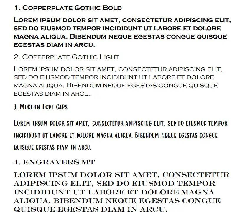
The best fonts that are all caps with the first letter bigger are Copperplate Gothic Bold, Copperplate Gothic Light, and Modern Love Caps. These are the only options that truly allow for the capital letters to appear bigger when you first type them out.
Copperplate Gothic Bold
Copperplate Gothic Bold is the best font that comes with all caps, and the first letter is bigger than the rest. If you write it like any other font (where the first letter of the word is capitalized), you’ll notice that the first letter is the largest one of all the others.
Basically, the lower-case letters are just smaller capital letters. There is no way to type a true lower-case letter with a font like Copperplate Gothic Bold, which is what makes it such a great choice when you’re looking at it in terms of this font style.
It’s also a very striking font. A lot of people like it because of how it looks on the page. It’s easy to read, and it can work for both a title and as the main body of the text.
Since it can fit in just about anywhere, Copperplate Gothic Bold is a very popular choice. It works well in many different sizes, and the style always comes through where the first letter is larger than the rest.
Copperplate Gothic Light
Copperplate Gothic Light is another font from the Copperplate Gothic family. It’s the opposite of the “Bold” variation because all of the letters are written much thinner. It still works really well when you’re trying to have all letters capitalized, though.
What makes Copperplate Gothic Light so good is that it works really well in the main body of the text. Because of the “lightness” of the font, it’s an even better choice over Copperplate Gothic Bold if you’re trying to look for a readable font that is in all caps.
The only issue is that it might not translate as well into a title. Some people don’t like using it as much for a title because it doesn’t come with the same boldness that they’re looking for.
Nevertheless, it’s still a very popular font choice. You’ll find it’s used in many situations when people are looking for that first letter to be larger than the rest.
Modern Love Caps
Modern Love Caps is another great choice that comes built-in with Microsoft Word. It works well because it introduces an entirely different style to the capitalized font while also allowing the first letter to be bigger than the rest.
“Caps” in the font name means “capital letters.” It’s used to show that every other letter in the font is written as a capital, even when you want them to be lower case. These lower-case letters are thus smaller in Modern Love Caps, but they are still read as capital letters.
The interesting thing about Modern Love Caps is that it comes with a unique style. While the Copperplate fonts look more traditional, like most Word fonts, Modern Love Caps comes with a friendly, crazy style that a lot of other fonts simply lack.
It’s a fairly popular choice because of this unique take that it has on capital letters.
Engravers MT
Engravers MT is the next best font you can use. Unfortunately, it doesn’t meet the exact criteria, but it does allow every letter to be capitalized in your writing. You just have to make sure you change the font size of the first letter of the word.
Engravers MT is a good font that has every letter capitalized. Changing the font of the first letter by one or two pixels will work wonders if you’re trying to look for a way to include it in your writing.
It’s a very popular font, too, making it a solid choice for most. You’ll find it very useful in most situations, and it can certainly stand out on a page compared to others.
Felix Titling
Felix Titling is another good font that comes in an all-caps style. That does mean that you’ll have to manually make the first letters of the words larger, but once you’ve done that, you can use it just as effectively as most of the fonts on this list.
Felix Titling is a good choice that many people overlook. It might not be the most popular choice because it’s not well-known, but it introduces an interesting, thin style to your capital letters.
Because the letters are quite thin, it works in both titles and the main body of the text. It’s up to you to determine where you think Felix Titling will look the best.
Castellar
Castellar is another all-caps font. You’ll want to make sure you change the size of the first letter to be more in line with the theme of this article. It’s an interesting one because it has faint white lines in the middle of the letters that most other fonts don’t include.
The font itself looks as if the white lines are the letters, and the bold black lines around those are used to highlight or outline the words. It’s a great way of trying to entice people into reading a document since it’s not often you’ll see a font like this.
The Serif Hand ExtraBlack
The Serif Hand ExtraBlack is a thick font that comes in all caps. Yet again, you’ll want to ensure that you can make the first letter of each word larger than the rest by manually changing the size used.
Once you’ve changed the size of the first letter, you’ll find that The Serif Hand ExtraBlack is one of the best fonts you can use for this situation. The spacing between the letters is perfect when you’re trying to change the sizes of the letters used in certain words.
A lot of people like the look of The Serif Hand ExtraBlack, too. That’s always a good thing to know before you decide on whether you want to use the font.
The Serif Hand
The Serif Hand in itself is a good choice as well. You don’t have to use the ExtraBlack variation. The Serif Hand works well when you’re trying to write the main body of the text. The spacing between the letters makes this one excellent when you manually change its size.
The Serif Hand is about as popular as the ExtraBlack variation. It works well for the main body of the text, though you might also find it has its uses as part of the title.
Stencil
Stencil is another solid font choice. It is all capitalized, so you’ll have to make sure you manually change the size of the first letter. Still, the unique style of Stencil is what makes it such a valid choice when you’re trying to look for something that sticks out.
If you like the look of art stencil writing, you’ll love how Stencil looks on a page. The idea of the font came from how lettering works when stencils are used for graffiti or spray painting.
It’s a very popular font for most titles. Generally, it doesn’t get used much outside of titles because it doesn’t always flow that well in the main body of the document.
Goudy Stout
Goudy Stout is a bubbly font that comes with a lot of excitement. People like to use it in their titles, and it contains nothing but capital letters. Again, that means you’re going to have to manually change the size of the first letter, but it’s a good way of introducing the style.
Most people use Goudy Stout for their titles. It’s eye-catching and appealing, making it a fantastic choice if you’re looking for something exciting that’s bound to capture the attention of your readers.
Showcard Gothic
Showcard Gothic is another all-caps font that’s worth mentioning. You will still need to make the first letters larger than the others, but it works well once you’ve managed to introduce this writing format into your presentation or document.
Just like Goudy Stout, Showcard Gothic thrives as a title. It’s a font style that can be tricky to read if you include it alongside multiple words, but it can be a great one for only a handful of words in a title.
You’ll easily catch the reader’s attention by using one like this.
Algerian
Algerian is the last font we want to run through. It deserves mention on this list because it’s another all-caps font that can benefit from having the first letter larger than the others. You’ll have to change the size of the letter manually, though.
Algerian is a popular choice for many people. There’s a unique style about it that you don’t find in most basic Word fonts. It’s worth using yourself to see whether it’s something you can include.
You may also like:
12 Largest Fonts in Microsoft Word [Size 12 Comparison]
12 Best Harry Potter Fonts in Microsoft Word
12 Fonts That Look Like Children’s Handwriting in Word