Military fonts can be fairly hard to come by in Microsoft Word. Most of the time, military fonts and stencil fonts in Microsoft Word are synonymous, but only one “Stencil” font is built into Word. This article will explore some options that can work as well for a military font.
Best Military Fonts in Microsoft Word
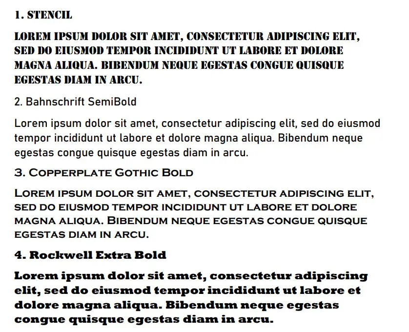
The best military fonts are Stencil, Bahnschrift SemiBold, and Copperplate Gothic Bold. Nothing beats Stencil if you’re looking for a true military-style stencil font, but the other two come close when you want something that features the same boldness that military fonts have.
Stencil
Stencil is the best military font in Microsoft Word. Most people would argue it’s the only military font in Word. That’s because it is a stencil font, and people like to use the stencil theme for military fonts because it looks identical to the fonts used on military equipment.
Stencil is the best way to show that you are respecting the military with a font. Since it’s common for the army to use stencils to spray paint over their equipment and use thick fonts, you’ll find that Stencil is the truest variation of this practice.
It’s quite a popular font for titles in Word, making it a solid choice for most documents and presentations. It also captures all the energy you might expect from a military font, allowing you to create a more dominating or superior feel to your writing.
Thickness and boldness are most important if you’re trying to create a military font. Stencil achieves both of those things with little effort.
Bahnschrift SemiBold
Bahnschrift SemiBold might not be a stencil font, but it’s a close second if you’re looking for a military font. You can think of this font as more related to how people might write in the military with a computer to show power rather than using a stencil and spray paint.
It’s like Bahnschrift is a more modern take on stencil fonts (since stencils aren’t commonly used anymore). It’s not the most imposing font of the ones we’re going to cover, but it’s certainly up there as a font that will hold its own in a military setting.
In terms of popularity, Bahnschrift is still a new font. It was only released in 2017, meaning it hasn’t had much of a chance to take off like some of the other fonts on Word.
Copperplate Gothic Bold
Copperplate Gothic Bold is another great font that allows you to show off a bit of that military theme. It allows you to write every letter as a capital, but the first letter of each word is always larger than the rest if you write it in a title.
This style allows Copperplate Gothic Bold to stand out above the rest. To top it off, the “Bold” name in the font shows that it’s got a thickness to it that should be present in military fonts.
It’s a popular choice for most titles, though the capitalization might make it a bit difficult to read in the main body.
Rockwell Extra Bold
Rockwell Extra Bold takes the boldness that we’re looking for in a military font to the next level. The “Extra Bold” in the font’s name should be a giveaway to show you just how thick the letters become.
This is a very imposing and powerful font that makes the most of its boldness. You’ll find that it can work wonders if you’re looking for something more militaristic, even though it doesn’t quite capture the stencil feeling.
The best part of Rockwell Extra Bold comes from the thickness of the serifs on each letter. That thickness is found similarly in fonts like Stencil, which is why it can work really well as a military font.
Impact
Impact is another bold option that’s available to use as a military font. If you’re looking for something that has an “impact” on the page, then you don’t need to look further. As its name would suggest, Impact is a very memorable font.
The only issue that you might come across with Impact is that it seems a bit overused. A lot of people would rank it alongside something like Comic Sans, which was once a very popular font, but now has been overused.
If you still like the look of it, there’s nothing wrong with using Impact. It’s a solid font that still gets a lot of common uses today. That’s what is most important when you’re looking for a font for this context.
Franklin Gothic Heavy
Franklin Gothic Heavy is a great font that comes from the Franklin Gothic family of fonts on Word. This family of fonts is fairly popular, and you can choose the boldness you go with. “Heavy” is the boldest of the Franklin fonts, making it the best for a military style.
Compared to some of the other font options, Frankin Gothic Heavy is actually quite small. While it might look very bold and thick, it isn’t a tall font. It’s one that would require someone to be a little bit closer to the page to be able to read correctly.
Arial Black
Arial Black is another good font variation that comes from a popular font family. The Arial font family is one of the most well-regarded families on Word. It used to be the default font choice for most Word versions, and its grasp is still present today.
“Black” is the best variation of Arial to use for a military font. You’ll find that it’s the boldest font, and thick, bold letters are the way to go if you’re looking for something that fits the military theme.
Arial Black doesn’t get a lot of usage outside of titles and headings, so it might be useful to try and find a good place for it. It’s certainly not one you should overlook.
Segoe UI Black
Segoe UI Black is a great variation that comes from the Segoe font family. While it’s not as popular as Arial or Franklin Gothic, Segoe offers a great variety in its fonts, and Black is the best for a military style.
Again, you will often find that Black (or bold) fonts are the best to use when you’re trying to achieve a military style. They allow you to show that there’s a lot of power behind whatever you’re writing about.
It’s a similar size to Franklin Gothic, though. You have to make sure you use it accordingly; otherwise, it could be a bit difficult for some people to read.
Wide Latin
Wide Latin is another good choice that relies heavily on the boldness of the font. It might not be commonly seen in the military itself, but it’s an assertive font that has made quite a name for itself.
In terms of large fonts, Wide Latin is one of the most popular. The width alone makes it very easy for most people to read. It’s a popular choice if you’re looking for something that stands out from the rest of the page.
Since military fonts rely so heavily on bold outlines and thick letters, Wide Latin is always going to be a good choice. Of all the fonts on this list, it’s perhaps the largest one that is readily available on Word.
Agency FB
Agency FB is a great choice for a military font. The “agency” idea makes it seem like it’s a font used by agencies like the military. It’s not thick like the others, but the unique lettering and style really allow you to convey certain information on the page.
Agency FB is most commonly seen when you are writing about a new location. For example, you might see it in a military movie when a new location is being panned across. Agency FB will be used to highlight which location has been moved to.
It’s a bit more situational, and you won’t often find it gets used in other areas. Nevertheless, it’s still a decent choice that you can get a lot of use out of.
Colonna MT
Colonna MT is an interesting font that utilizes shadows a bit more. While the letters aren’t exactly thick like the rest, they offer a unique style that a lot of other fonts don’t. Colonna MT looks like a shadow has been formed out of two letters merging into one.
This unique style really makes Colonna stand out amongst the rest of the fonts. This can make it a solid choice if you’re looking for something that’s bold enough to suit the military without being over the top in how it looks on a page.
Imprint MT Shadow
Imprint MT Shadow is another great font that uses the shadow-like style that Colonna MT has. It looks like each letter has been made up of a combination of two letters being pushed together to create a thin white line between each letter.
This unique lettering style is why Imprint MT Shadow makes it on this list. It’s worth using to see if you like it yourself.
While it might not be as bold or dramatic as some of the other options, the unique shadow style is definitely something that helps to give it a voice on the page.
You may also like:
12 Best Fonts for a CV in Microsoft Word
12 Best Fonts for Academic Papers in Microsoft Word
12 Best Fonts for Notes in Microsoft Word