Victorian fonts are always great if you’re looking for a specific theme in your presentations or documents. This article will explore some of the best 19th-century fonts available right now in Microsoft Word. You might be surprised by how many options there are.
Best Victorian Fonts in Microsoft Word
The best Victorian fonts in Word are Century Schoolbook, Bookman Old Style, Baskerville Old Face, and Goudy Old Style. You might notice that each font has a reference to “old” or “century,” which shows that they’re more in line with the traditional look that fonts had back then.
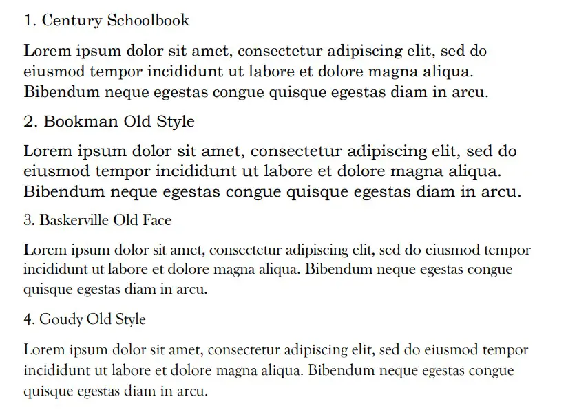
Century Schoolbook
Century Schoolbook is a great font choice if you’re looking for something that fits the Victorian theme. It’s a great font for formal occasions, and it can also work well if you’re only using a Victorian font to show a specific theme or style in your document.
“Century” implies that it’s an old-fashioned font. It is quite common to see this font in period novels that are set in the past, which speaks volumes about how good it can be when you’re using it as a serif font to show off a Victorian style.
The “schoolbook” aspect of the font also comes from the idea of Victorian schools. It was common for students to be taught proper grammar and write in a specific way. While they didn’t write in a serif font, it’s still a good way to showcase the theme of the Victorian century with a font.
Bookman Old Style
Bookman Old Style is another good font that gets used a lot in period novels. It is an old-fashioned font that stays true to its original values. The “Old Style” portion of its name is what’s most important here. It shows that it is supposed to be a dated font that works well.
You can use Bookman Old Style for many different situations. It’s quite large, so it makes for one of the easiest-to-read fonts on this list without looking informal in any way.
The key to a Victorian font is its formality, and serif fonts do a good job of demonstrating that formality. Bookman Old Style is a great font to demonstrate a more 19th-century feel to your writing. It is a good way of allowing your readers to immerse themselves in a more classical theme.
Baskerville Old Face
Baskerville Old Face is a good choice if you’re looking for something more old-fashioned too. It’s a great choice because it allows you to show that you’re writing in a more classical style. Again, this is another font that is commonly seen in novels.
It’s very easy to read, which is why it’s so commonly seen in novels. A lot of people like it as well because it’s a fairly small font that can allow you to include a lot of words on the page at one time.
You’ll find that this is among one of the more popular font choices when you’re looking for a 19th-century font. It’s very clear in its design, and you can use it in many situations. While it definitely suits more formal situations, there is nothing wrong with it being more informal as well.
Goudy Old Style
Goudy Old Style is the last font choice on this list that makes a direct reference to the old-fashioned style in its name. Again, it uses “Old Style” to show that it’s supposed to convey a more Victorian vibe to the things you’re writing about.
You can use this font really well if you’re trying to show a more 19th-century vibe in your writing. It is mostly the style that allows it to convey this more old-fashioned vibe, so the content of your writing doesn’t matter as much when you’re using it.
Goudy Old Style is quite a popular choice, and it comes from the Goudy font family. The font family itself isn’t all that popular, but Old Style certainly gets used a lot when people are looking for a more old-fashioned style of writing.
Bodoni MT
Bodoni MT is a good font choice that often gets overlooked. You can use it to relate to a Victorian theme or style, and it’s good to use if you’re trying to present a more old-fashioned theme or write a period novel of some kind.
Bodoni MT has a few different types to it, but the basic type is the best one to use if you’re specifically looking for a Victorian style. It works well because of its size and readability.
It is slightly bolder than most of the other fonts. There is a thickness to the letters that some people might find jarring, while others might find it much easier to read because of the thickness.
Garamond
Garamond is a suitable font when you’re looking for an old-fashioned serif style in your writing. Serif fonts work really well when you’re trying to recreate how things might have been typed in the 19th-century (on typewriters mainly).
Garamond is a fairly small font, which can allow you to fit a lot of words into a small area. Some people like to do this when they have a lot to say, while others might argue that it can make your writing much harder to read overall.
Times New Roman
Times New Roman is the default Microsoft Word serif font. It’s very common because it’s automatically assigned on most systems when you’re looking for a formal font that works well. The serif style also allows you to convey a Victorian theme in your writing.
Some people might argue that Times New Roman should be lower on the list because it’s too common. When looking for a specific Victorian font, it might be better to use something that people don’t see as often, as Times New Roman is overused in many areas.
Book Antiqua
Book Antiqua is a great font that relates to the same “Book” idea as Bookman Old Style and Century Schoolbook. It is a good one that works well in period novels, which usually shows that it’s a suitable font that can be used in a Victorian style.
People like Book Antiqua for its simplicity. It’s another common font that people like to use when writing novels, and you’ll often find that it works really well when you’re looking for something that is readable and easy.
Lucida Bright
Lucida Bright is part of the Lucida font family, and it can work well in many situations. It is a very popular family, and there is a Lucida font for every situation. “Bright” makes for the best Victorian font because of the serif style that comes with it.
You can use Lucida Bright in many ways, and it’s a helpful one to include in more formal pieces. As a presentation piece or as part of a document, Lucida Bright is a good choice if you’re looking to introduce a slightly more old-fashioned theme or feel.
Like many of the other fonts on this list, Lucida Bright also works well in other areas. It’s a generic serif font, which can allow you to write it in many formal situations, and it’s going to work wonders for many different documents.
Perpetua
Perpetua is a great choice if you’re looking for an old-fashioned font. It’s by far the smallest font choice relative to its size, but it uses the same serif style that a lot of the fonts used to convey a more old-fashioned vibe.
You’ll find that Perpetua is quite good at fitting in multiple words on a page. It’s a good way of including a lot in your writing by using a font to help you make it look much smaller.
While it’s not a particularly common choice, it is one that allows you to get a lot out of it. You’ll often find that it works well to demonstrate a more old-fashioned or century vibe to it.
Rockwell
Rockwell isn’t always used as its own font. A lot of people prefer the more impactful variations like Rockwell ExtraBold. However, when Rockwell is used as its own font, it’s actually very useful if you’re trying to convey a more old-fashioned tone to your writing.
Rockwell has a very solid serif style that works really well when you’re trying to write in a Victorian style. It’s a good choice that a lot of people will recognize, even if they are more familiar with other members of the Rockwell family.
It’s a regular-sized font, which makes it easy enough to read without being too big to seem a bit more informal than anything else.
Georgia
Georgia is a very popular font choice that comes up in many situations. It’s a good formal font that works well because of the serif style that comes with it. You can use Georgia for multiple situations, and the Victorian style is just an added benefit of it.
People like Georgia because it can work in multiple areas. You’ll often find that Georgia is used for headings, sub-headings, and the body alike. There are no places where Georgia doesn’t fit in.
You may also like:
12 Best Chalkboard Fonts for Microsoft Word
12 Best Serif Fonts in Microsoft Word
12 Smallest Fonts In Microsoft Word