Calligraphy fonts are always fun ones to look at. People like to explore calligraphy fonts because of how interesting they can be. They certainly add a lot of character to the page. This article will explore some of the best calligraphy fonts out there.
Best Calligraphy Fonts in Microsoft Word
The best calligraphy fonts in Microsoft Word include Edwardian Script ITC, Kunstler Script, and Lucida Calligraphy. If you’re looking for suitable calligraphy fonts that cover all aspects (like old English, modern, and Egyptian fonts), then these fonts and many others will help you out.
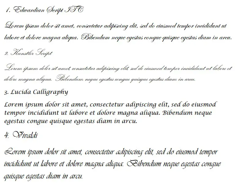
1. Edwardian Script ITC
Edwardian Script ITC is a great font that captures the original theme of calligraphy. It’s a very subtle font that follows all the kicking curls and cursive flairs that most calligraphy fonts try to capture.
While it can be difficult to read, this is also part of its charm. People have a hard time reading calligraphy at the best of times, so it makes sense to find a font that matches that same feeling.
It’s a fairly small font, but it has to account for some of the flicks and stylistic flairs of calligraphy. Usually, when certain letters have to drop under the lines, other letters are made smaller to account for that.
2. Kunstler Script
Kunstler Script is another good calligraphy variation. Any font that contains “Script” is usually a good sign for calligraphy. It shows that the font was designed to be used as part of a script. Often, they would have been written with ink and quill.
Kunstler Script is even more difficult to read than Edwardian Script. The letters almost fuse into one solid line. It looks as if someone has kept their pen on the page for as long as physically possible before moving to the next word.
Again, this is ideal when you’re looking for calligraphy fonts. If you want to capture the same vibe or energy that traditional calligraphy does, then Kunstler Script is a great choice to help you out.
3. Lucida Calligraphy
Lucida Calligraphy is the easiest font to read on this list. It makes for a refreshing change compared to most calligraphy fonts because it’s something that is welcoming and allows most people to make the most of it.
Since the name includes “Calligraphy,” it makes sense that it can be used as a calligraphy font. It’s a very large font (the largest on this list), and it allows the reader to really comprehend what you’re trying to say.
Due to it being so easy to read, Lucida Calligraphy is one of the most popular fonts on this list. People like to use it because it’s large, but it still contains all the usual trends you’d expect to see when recreating calligraphy with a font.
4. Vivaldi
Vivaldi is a great choice that helps to bring things into the 17th century. It’s named after the Italian composer Vivaldi, and it recreates the same feeling seen in the calligraphy of his era.
The lines and curls that come from this font are unlike any of the others. It shows careful and elegant quill strokes that most of the other fonts miss. There are also varying line boldnesses going on which indicate that different pressure was applied to different strokes.
Unfortunately, Vivaldi isn’t as popular as some of the other fonts. Since fonts in Microsoft Word are ordered alphabetically, it can be difficult for the ones that begin with the latter letters of the alphabet to take off in popularity.
5. Vladimir Script
Vladimir Script is a great “script” font that introduces a new take on calligraphy. Unlike most of the others, Vladimir Script is written to an italicized degree, even if you don’t mark it in italics.
The angle of the letters of Vladimir Script is what sets it apart from the rest. It’s a great choice because it introduces a new theme on calligraphy that can really add value to your work.
Again, though, a lot of people overlook this one because it’s so low down on the alphabetic list of Word fonts. You should give it a go to see whether you like it.
6. Monotype Corsiva
Monotype Corsiva is a great calligraphy font that is very easy to read. Like Lucida Handwriting, Monotype Corsiva is for anyone who is looking for a calligraphy font that meets the criteria but also provides the reader with a chance to understand what’s happening.
Since calligraphy isn’t a common or popular writing style anymore, it has become fairly difficult to read. Most people will look at calligraphy and maybe be able to make a handful of words. Anything more than that becomes too difficult, meaning that most people give up.
With Monotype Corsiva, you don’t have to worry about whether people can work out what you’re writing. It tackles traditional calligraphy by putting a more modern spin on it. It’s a great choice if you’re looking to help out your readers.
7. Freestyle Script
Freestyle Script is a great “script” font that people often overlook. It’s the most informal calligraphy font on this list, but it’s a good choice if you’re looking for something that isn’t supposed to overwhelm your readers.
It’s considered more informal because it doesn’t come with all the usual flicks and curls that most calligraphy does. It is much easier to read than that, and it only contains little flicks where it’s necessary (like underneath the letter “y”).
It’s a fairly popular font choice because of how familiar it looks. It doesn’t rely heavily on the original calligraphy rules, so most people prefer to use it.
8. French Script MT
French Script MT is a good “script” font that goes back to the traditional calligraphy rules. This one has plenty of curls and flicks with each letter to show that someone is flicking their quill across the page to get the letters out.
Size-wise, French Script MT is one of the smaller fonts on this list. It’s a great choice, but you have to make sure you account for the size if you’re going to use it too much.
If you keep it at its smaller size, you might find that some people have a difficult time understanding what you’re writing.
9. Brush Script MT
Brush Script MT is another great “script” font. It’s a bit bolder than the others because it’s supposed to simulate a paint brush stroke rather than a simple pen or quill stroke. It’s a great font that introduces a new layer to the original calligraphy formula, though.
It works really well because of its style. It’s not thin and difficult to read like many of the others. Instead, it’s much more comprehensible on the page. A lot of people are comfortable with how it looks because it is bold enough to make out even from a considerable distance.
On top of that, it still captures the same energy that most calligraphy fonts depend on. There are subtle strokes that flick off letters to show that someone has taken their brush away from the page.
10. Palace Script MT
Palace Script MT is the smallest font on this list. Due to its size, it can be fairly difficult to read. We recommend using it as the main body of the text, though you might want to size up a few pixels to make sure that it’s a bit easier to read.
While it might be smaller than most, it’s still an attractive font that comes with a sense of royalty. You can probably expect that to be the case, considering it’s named after a “palace.”
11. Script MT Bold
Script MT Bold is another interesting “script” font. It’s fairly similar to Brush Script MT, where it’s more in line with a thick brush stroke rather than pens or quills. It still captures most of the usual trends of calligraphy, even though it’s a bolder font than most.
Since it’s so bold, it’s a great choice to include as part of a title. It might not be the most suited to large bodies of text, but it will do a great job when you want to try and introduce someone to your calligraphy presentation or poster.
“Bold” is in the name, so that’s why you can expect it to remain bold, whether you want it to or not. It’s a very popular choice because of how easy it is to read, though.
12. Blackadder ITC
Blackadder ITC is a fairly popular choice that follows most of the calligraphy trends. We didn’t include it higher because some people believe it doesn’t stay true to form to most of what is expected from calligraphy fonts.
It has some very attractive curls to most of its letters, though, which gives it an interesting theme over some others. The letters also look a little disorganized, which could work well if you’re trying to show that it was written by a human rather than a robot.
Blackadder ITC is a surprisingly popular font compared to most. While it might not capture the exact thing you’re looking for, it’s still a decent option if you want a calligraphy font.
You may also like:
What Is the Disney Font Called in Microsoft Word?
12 Best Western Fonts in Microsoft Word
12 Best Coding Fonts in Microsoft Word