Fonts are one of the most instrumental things when you’re presenting your writing. You’ll want to pick the perfect font to make sure that people truly appreciate the things you write. Different fonts have different purposes, and this article will look into the best cursive fonts in Microsoft Word.
Best Cursive Fonts In Microsoft Word?
The best cursive fonts in Microsoft Word are Brush Script, Edwardian Script, Freestyle Script, and Gigi. All of these are great options when writing in a more fancy, cursive style. Most of them relate to “script” (other than Gigi), showing that they’re all related to script and cursives.
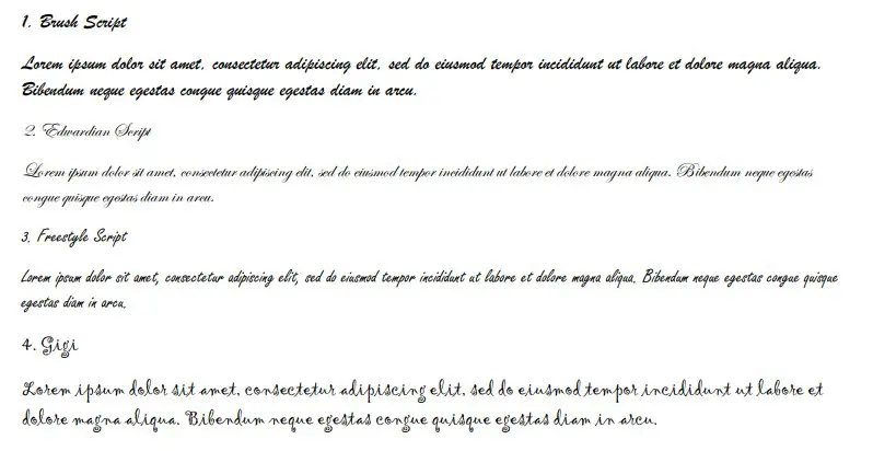
1. Brush Script
Brush Script is one of the most popular cursive fonts out there. It’s got just about everything that people look for when it comes to cursive writing. Amongst other things, it’s also one of the most easy-to-read cursive fonts in Microsoft Word right now.
The biggest issue that most people have with cursive fonts is readability. While it looks great to showcase a fancy font, it’s not always the easiest to read without great effort.
Brush Script comes with a solid boldness about it that really makes it stick on the page. It runs true to the font size as well, making it an excellent choice regardless of the size used (some cursive fonts tend to be too small for the selected font size).
Needless to say, this is a very popular script choice for cursive writing in Word. You’ll find that this is definitely one of the more popular ones, and most people will choose to use it.
2. Edwardian Script
Edwardian Script is a great choice if you want to add a little bit of royalty to your writing. The style relates back to how cursive writing looked in the 19th-20th century. People would use this type of cursive when they wanted to show that they were upper-class.
This script is fairly popular today because of its ties to royalty and class. It’s common to see this used when the theme of your writing calls for more old-fashioned cursive fonts.
Perhaps the only major issue with this font comes from the slight sizing disparity. It does seem to be a little smaller than the other cursive fonts, making it a bit more difficult to read unless you size it up.
3. Freestyle Script
Freestyle Script is almost the opposite of Edwardian Script. It brings the cursive font into the modern age and is known as one of the more casual cursives. There aren’t as many flicks or flairs with Freestyle Script, making it much easier to read.
Freestyle Script is by far one of the easiest fonts on this list to read. It doesn’t have any added “noise” in the cursives that might make it harder for some people to understand.
That’s why it’s deemed the more “modern” choice of the group. It’s a great way of introducing cursive writing into your documents without going overboard, making it difficult for people to read.
4. Gigi
Gigi is the first font choice that doesn’t come with the added “script.” It’s a fairly versatile font, allowing you to use it in areas outside of cursive writing, too. Most people use Gigi for the interesting swirls you will find around the lips and flicks.
If you typed “Gigi” with the Gigi font, you would notice three distinct swirls within the two “G” letters. This kind of style is attractive to many people, which is what makes Gigi such a popular font choice for most people.
Since it already comes built in with Microsoft Word, most people have at least tried out Gigi in their time. Whether they choose to stick with it or not depends entirely on what they are writing about.
5. French Script MT
French Script MT comes from the more traditional French variation of cursive writing. It’s great if you’re looking for something that follows more old-fashioned and formal cursive trends.
Most people that use French Script MT do so because they want to remain formal and respectable. It’s definitely one of the more respectable fonts on this list, making it only suitable for more formal writing or presentations.
The curls that you get out of the cursive font of French Script MT are also different than the other fonts. They’re worth looking into just to see whether you enjoy the way the cursives connect.
6. Kunstler Script
Kunstler Script is an italic font that works well for cursive writing. Some people struggle to read it, and it is one of the more difficult fonts to read on this list. Since it is entirely italic without any separations in the letters, it can make for an interesting challenge.
With that said, Kunstler Script is still an attractive font. A lot of people are drawn to it because it brings something to their cursive writing that they would otherwise miss.
7. Lucida Handwriting
Lucida Handwriting is a classic font choice. There are many branches to the “Lucida” font, but handwriting is by far the best one when it comes to cursive fonts. It allows you to express your writing in a more seamless yet elegant fashion.
It’s also easy to read, which is why so many people enjoy using it themselves. It is thick and bold, without any issues when it comes to using slightly smaller font sizes.
If you use this in your writing, you are probably already aware of how easy it is for people to work out. It’s an excellent addition to your font choices if you haven’t decided to use a cursive one yet.
8. Magneto
Magneto is a somewhat unique choice on this list. It looks entirely different from most of the other options, making it an exciting choice for a lot of writers that like to type in cursive.
Magneto is thick and uniform. While most of the other cursive fonts have elegant and curly flicks, Magneto has straight, direct lines between its letters. These lines often connect to the next letter, making it look like the word flows just like any other cursive font.
Some people would argue that Magneto does not count as a cursive font. While this may be true in some cases, it is still a fantastic choice if you’re looking for something new.
People like using Magneto because it stands out. It sets itself out from the other cursive fonts, making it one of the most visually striking options to use on this list.
9. Mistral
Mistral goes back to a more traditional style of cursive writing. It looks more like a scribble with some elegant curls to it, making it a decent choice when you’re looking for more informal yet impressive options.
Mistral is a fairly popular font for certain themes. If you’re looking to write in a cursive style that looks like it’s more modern than some of the others, Mistral is probably one of your best choices.
It also allows most of the letters to bunch up with each other. This means a lot of letters can be condensed into the same line, which could either make your writing great (by including lots of information) or difficult to read (by having too many words on one line).
10. Rage Italic
Rage Italic is a good choice for more casual cursive writers. It’s a simplistic style, which is fairly easy to read. The theme of Rage Italic looks as if someone has been rushed and had to scribble out some of their cursive.
While it might not be as “finessed” as some of the other fonts, it’s still an attractive option. People like to use it because it is more casual, and the style that comes with it shows that their work isn’t quite as serious as other cursive fonts might suggest.
11. Palace Script MT
Palace Script MT is the smallest font of the bunch in this list. It runs incredibly small compared to the font-size selection, making it fairly difficult to read for many people. Nevertheless, it’s still a great cursive font that takes into account all the traditional cursive writing rules.
People that use Palace Script MT are often trying to theme their document or presentation in an elegant way. Since it uses the word “Palace” in its name, it makes sense that it’s deemed to be more regal or upper-class than some of the other cursive choices available.
12. Segoe Script
Segoe Script is a fascinating choice that is incredibly easy to read. We would go as far as to say it’s the easiest font on this list because it runs large to the font size and doesn’t have any excessive flicks around the cursives.
For most people, Segoe Script is a cut above the rest. It can work really well when you’re trying to demonstrate something in your writing while keeping the cursive idea.
The only reason it didn’t rank higher is that some people argue that it’s barely a cursive font. Although it has “Script” in the name, it barely follows all the cursive trends that most of the other fonts make the most of.
You may also like:
12 Most Scary Fonts for Halooween in Microsoft Word
12 Cute Fonts in Microsoft Word
12 Best Handwriting Fonts in Microsoft Word